- Details
- Category: Developer News
The Appflow team recently attended Chain React, the largest React Native conference in the United States. Industry leaders shared the latest in mobile development trends and technologies, including key takeaways and learnings you can apply for your own team.
Here are some of the main mobile development trends highlighted at Chain React, along with resources for implementing these for your own React Native app development.
Cross-platform apps are just as performant as native
One of the long-standing myths of mobile development is that cross-platform apps aren’t as performant. Educator and senior engineering leader Ankita Kulkarni busted that concept in her talk, “The performance myths of React Native.”
Her presentation addressed the arguments we’ve all heard before, but from experience know aren’t necessarily true, including:
- “JavaScript isn’t enough”
- “You can’t animate correctly”
- “Performance issues such as high CPU, etc.”
She demonstrated that React Native apps can be just as performant as traditional native apps when developed with performance in mind. This includes paying attention to when renders occur, leveraging performant animation libraries, and using performance profiling tools to identify optimizations and measure on different types of devices. You can check out the entire talk on YouTube here.
Here at Ionic, we’ve known for years that cross-platform apps provide the performance and experience that users expect from a mobile app. In a recent blog post on performance with Ionic and Capacitor, analysis showed that performance metrics exceeded Lighthouse standards, even when running a video streaming application.
Colin Gray, principal developer at Shopify, also talked about performance and the journey of moving Shopify’s native iOS and Android apps to React Native in this talk “Default to Performance.” He shared techniques for measuring performance, as well as performance best practices for state management, React hooks, and using components with built-in performance enhancements. You can view his talk on YouTube here.
Both of these talks showcased the performance capabilities of cross-platform apps – an important takeaway at Chain React. Get started building your own performant cross-platform apps using Capacitor by learning more here.
Automation and tooling eases the complexity of mobile deployments
Mobile deployments aren’t easy, and deploying cross-platform to Android and iOS makes it even tougher. Another trend at Chain React was how automation and tooling can help with the complexity of mobile deployments.
Cecelia Martinez from the Appflow team (hi, that’s me  ) covered how to incorporate automation into the
deployment process in “Signed, Sealed, Deployed: Shipping React
Native Apps.”
) covered how to incorporate automation into the
deployment process in “Signed, Sealed, Deployed: Shipping React
Native Apps.”
The talk walks through the entire process of shipping a React Native app, including configuration, building, testing, uploading to app stores, and even maintaining your app.
It also included how Appflow, the mobile CI/CD platform built by Ionic, can help you automate deployments. Appflow takes care of the more complex aspects of mobile deployments, including signing certificate and build stack management.
Check out the full talk on YouTube here, and get started for free with Appflow today.
Superapps can help teams scale mobile app dev quickly
Finally we come to one of the newest and most exciting emerging trends in mobile development from Chain React: Superapps.
Superapps let you integrate multiple different services or mini apps – developed and managed separately – into a single user interface. Michal Pierzchala, head of technology at Callstack, discussed how superapps can be a boon for developer autonomy and productivity in his talk “Scaling teams with federated superapps.”
In his talk, he covered the organizational issues that exist for large teams that superapps can address. These include ownership conflicts, interdependent release schedules, and shared deployment resources. Superapps allow teams to build and ship independently so they can move faster for a better developer and user experience. Michal’s talk focused on Re.Pack, a Webpack-based toolkit for superapps on React Native, built by Callstack.
Ionic’s solution for superapps, Portals, allows developers to build superapps for native Android and iOS, as well as React Native. Portals provides secure, standardized tooling for integrating web mini apps into native superapp, so developers can move fast without compromising on user experience or app performance. Get started with Portals here for your own superapp.
Capacitor developers aren’t left out either – they can use Federated Capacitor to build a new superapp or modernize an existing Capacitor application. Learn more about Federated Capacitor in the blog post here.
Check out Michal’s full talk on YouTube here.
The future of mobile and web
These key trends and takeaways from Chain React show that cross-platform apps are the future of development. Leveraging the best of both mobile and web is key to building performant apps, deploying them quickly, and scaling your development teams fast with superapps.
Ionic is leading the way on all these mobile development trends with solutions for every type of team, so make sure to stay up-to-date on everything Ionic to leverage the latest and greatest for your own apps.
The post Mobile development trends from Chain React appeared first on Ionic Blog.
Read more https://ionic.io/blog/mobile-development-trends-from-chain-react
- Details
- Category: Developer News
This is a guest post written by Grgur Grisogono, Director of Engineering at Modus Create.
Micro frontends have been rapidly gaining popularity in the development of modern web applications. However, while micro frontends offer several benefits, including improved scalability, agility, and faster development cycles, they also come with several security challenges. In this article, we will explore common micro frontend security issues for the web and hybrid mobile apps.
Inconsistent Dependency Management
One of the biggest benefits of micro frontends is democratized development, with teams getting to choose their own dependencies. As an application team’s digital footprint grows, naturally, two or more apps will eventually share dependencies but in different versions. While modern runtimes like the ones shipped with Module Federation will have no problem dealing with versioning discrepancies, mismatches can be a major flaw of micro frontends.
In a simpler scenario, two micro applications could use different major versions of the same library. In that event, most runtimes will choose to load both versions, respectively. While this will work fine in many cases, the system is clearly not optimized and may execute vulnerable code from the outdated library. Micro frontends don’t have a straightforward upgrade path mechanism, so teams need to figure out how to stay up to date collectively.
This third scenario has an interesting twist, making it far more complex. Suppose the shared library is a singleton, meaning only one version can be loaded simultaneously (e.g., React, Styled Components). In that case, we no longer have the luxury of loading different versions in independent sandboxes. Instead, the first version loaded stays active and reused across the stack. Most singletons will break, requiring all micro frontends to run the same version. Libraries with excellent backward compatibility will work fine, but these are rare.
Running the same version across the stack wouldn’t be a significant setback had it not been for the maintenance issues. Unfortunately, updating such a library can be incredibly difficult because all micro frontends must be updated simultaneously, which is sometimes impossible without causing problems for app users.
Unfortunately, there isn’t a universal technical solution to this. The best advice is to avoid singletons and resort to the standards. Leverage your client’s powerful browser to the greatest extent possible.
Another helpful tip is to implement semantic versioning for your micro frontends. Versioned apps can help teams understand the level of changes between two deployments.
A more complex approach to managing conflicting dependencies is to integrate a custom dependency manager (i.e., a global lock file). Your build step can record and compare dependencies with other apps in the system and suggest alternatives where applicable.
Authorization Token Sharing in Hybrid Mobile Apps
Authentication in hybrid mobile apps is usually a part of the native code since there are no callback URLs in SSO. As discussed at my Building Superapps in Mobile talk at Micro Frontends Summit 2023, it’s common for apps to create secure storage for the authorization token on the native side but then provide that token for the JavaScript code to communicate with a backend. This is already an improvement from the regular mobile web, as secure storage on the native side is superior to the browser capabilities.
However, a malicious attacker can tap into the JavaScript code to access shared tokens. A safer solution is to let the native side of the app communicate with the server. While implementing and maintaining such a bridge comes at a cost, it ensures that sensitive tokens are never accessible to interpreted code.
In other words, the native application shell serves as an asynchronous service to the UI, similar to microservices. Many organizations bank on that service to secure other sensitive data.
Feature Isolation
One of the most critical (yet awkward) recommendations for micro frontend architects and engineers is to avoid inter-app communication at all costs. It comes naturally to many developers to create service points for sharing data, making it sound like a ridiculous best practice. However, as your application scales, it will undoubtedly run into severe issues if you don’t isolate apps.
Since micro frontends sport at least some independent processes like the build step, deployment, test suites, or infrastructure, there are multiple points where potential attackers could sneak in. Implementing a zero-trust policy across the board will help mitigate such issues.
One way to improve trust policies is introducing Cross-Origin Resource Sharing (CORS) and Content Security Policy (CSP) headers in places such as:
- The application core – limiting allowed domains for feature loading
- Each frontend to its backend service – ensuring communication with trusted APIs only
If your micro frontends are loaded from different domains or
subdomains, you will want to have at least some of the policies
mentioned above in place. However, if you don’t care for such
security hardening, then at least set the
Access-Control-Allow-Origin CORS header to
“*” because that will avoid opaque responses. Opaque
responses misreport response size and some headers, which can
create issues with caching and even crash mobile browsers when the
browser cache size is exceeded.
For isolation to work, micro frontends should be deployed to predictable domains. CSPs work best when Frontends have respective subdomains at the cost of maintenance, especially when there are many apps to integrate.
In addition to isolating communication, it’s a good idea to enforce a zero-trust build step where any outbound communication is restricted. That helps create solid end-to-end isolation.
Conclusion
Micro frontends should generally implement the same security protocols as any web application. Even though micro frontend architecture is complex, it doesn’t bring significant security challenges by design. More so, they promote security by organizing business logic into independent, self-contained modules that can be secured autonomously.
The post Best Practices for Building Secure Micro Frontends appeared first on Ionic Blog.
Read more https://ionic.io/blog/best-practices-for-building-secure-micro-frontends
- Details
- Category: Developer News
Ioniconf, the event that brings together some of the most influential names in the Ionic community, is back! And this year- it’s in person.

As much as we love hearing “can everyone see my screen?” at the start of every virtual meeting, we figured that we’re all ready to meet up live and talk about all things Ionic. From what’s coming on the product roadmap to how some of the best developers are using Ionic, you are not going to want to miss this event. So pack your bags, charge your laptops, and get ready to join us in person as we celebrate the 10th anniversary of Ionic in style.
What’s in store
Join us in Austin, TX at the ZACH Theatre on October 10th and 11th for this epic two-day conference. These action-packed days will be filled with top-notch talks, amazing networking opportunities, and more Ionic knowledge than you can fit in a 10-gallon hat. We’re gathering the hottest names in the space to share their expertise, best practices, and latest techniques that will take your mobile app development skills to the next level. We’re talking real-world insights, practical tips, and a lot of inspiration.
And that’s not all– we’ll be taking a deep dive into the cutting-edge features and tools offered by Ionic. Uncover the secrets to harnessing these advancements and turbocharge your app development process to deliver extraordinary user experiences.
Get involved
As with past Ioniconf’s, we want to hear from YOU  and give you a chance to share your story. Want
to share your experience in getting your app to market? Have a cool
JavaScript library that you think others should know about? Or are
you just building some seriously cool stuff? Submit
your talk on Sessionize for your chance to be a speaker at
Ioniconf 2023.
and give you a chance to share your story. Want
to share your experience in getting your app to market? Have a cool
JavaScript library that you think others should know about? Or are
you just building some seriously cool stuff? Submit
your talk on Sessionize for your chance to be a speaker at
Ioniconf 2023.
Code meets cuisine
While this conference brings together amazing minds from around the community, we didn’t want your taste buds to feel left out. We’re bringing iconic Austin food trucks to serve up some seriously delicious eats. Because let’s face it, coding on an empty stomach is just not cool.
Enjoy mouthwatering flavors while you mingle with fellow developers who share your passion for building incredible apps. It’s the perfect recipe for both professional growth and a happy tummy!
See you there
Tickets are available now, and early bird pricing is only available for the first 100 tickets purchased- so if you want to stop reading and just get those tickets asap, we totally understand. If you want to learn more about the event, you can check out the website for more information.
Ioniconf 2023 is shaping up to be an unforgettable celebration of the Ionic community and its achievements over the past decade. We say it all the time, but it’s true – we owe so much to the amazing community of developers that are constantly helping us iterate and improve on all things Ionic. This event is a celebration of that community, and we can’t wait to hang out with you all in beautiful Austin, TX.
The post Join us at Ioniconf 2023! appeared first on Ionic Blog.
Read more https://ionic.io/blog/join-us-at-ioniconf-2023
- Details
- Category: Developer News
May marked Capacitor’s 4th birthday, so to celebrate – we cranked out tons of awesome Capacitor content. From livestream tutorials to community features, it was a birthday party to remember. Here’s what you may have missed:
The past, present, and future of Capacitor
We kicked off the celebration with a stroll down memory lane
with CEO and co-founder Max, who explained to us how the name
Capacitor came to be. (Hint: it involves avocados  )
)
Co-founder Ben Sperry also walked us through how he came up with Capacitor’s visual identity and branding. He even takes us through some of the older iterations and explains how we got the logo we know and love today.
In looking toward the future, we announced Capacitor v5, which is packed with features and enhancements to make for an even smoother developer experience. We also reintroduced Federated Capacitor (formerly known as Portals for Capacitor) for those who have large teams and complex applications. In short, Federated Capacitor empowers development teams to work at their own pace on their designated features without needing to worry about other teams’ speed or schedules.
Learning to build with Capacitor
When you build with Capacitor, the possibilities are endless – and our community showed us just that. Ionic Developer Expert Robin Genz wrote up a super easy-to-follow tutorial about how quickly and easily a new plugin can be developed and integrated into your Capacitor app. Ionic’s Logan Brade also took us through how to build a new Capacitor media plugin, and even hosted a livestream to walk through it in real-time.
We announced the integration of Kapa.ai into our Discord server, making it easier than ever to get help whenever you need it. Whether you’re just starting to build with Capacitor or are a seasoned professional, Kapa is great for answering almost any questions.
Throughout the month we also hosted a number of Discord Days, where our engineers hung out on Discord live to answer your questions as they came up. Between the Discord server and our forum, community members from all over the world are eager and ready to lend a helping hand as you build with Capacitor.
It takes a village
We say it time and time again – Capacitor is made infinitely better by the enthusiastic community behind it. We highlighted a few of those community members throughout the month (and they’re just the tip of the iceberg)!
The SQLite plugin is a community-maintained plugin utilized by countless apps. We have Quéau Jean Pierre to thank for its creation and are grateful to everyone who helps maintain it.
Aaron Saunders is a long-time community member that continues to make awesome educational content around how developers can leverage Capacitor in different ways.
Simon Grimm, another Ionic Developer Expert and founder of Ionic Academy, has created lots of dedicated courses for others to learn from.
No matter what you’re trying to build or how you want to build it – there’s a way to make it better with Capacitor, and the community can help.
Fantastic tools and where to find them
Our team has been hard at work improving Capacitor, particularly in developing new plugins that will make development even smoother. In expanding our presence in the mobile app security landscape, we built an SSL pinning plugin that helps defend apps from man-in-the-middle attacks.
But we haven’t just focused on enterprise – we’re still heavily
focused on the community. Those who joined our livestream got a sneak peek at
the latest OSS plugin coming to Capacitor.  We understand that some of the most critical app
features need the ability to run while the app is in the
background, and soon, they’ll be able to do just that!
We understand that some of the most critical app
features need the ability to run while the app is in the
background, and soon, they’ll be able to do just that!
Amazing plugins are no good if you can’t find them, so we’re thrilled to announce the new and improved Plugin Registry. Now, no matter what problem you’re trying to solve, you can easily find the perfect plugin for it.
We’re elated to see the continued growth of both Capacitor and
the community around it. With 1.5 million monthly installs (and
growing), we can’t wait to see what the future holds. We’re just
getting started. 
The post Capacitor Month: livestreams, plugins, and avocados – oh my! appeared first on Ionic Blog.
Read more https://ionic.io/blog/capacitor-month-recap-2023
- Details
- Category: Developer News
It’s official, the final stable release of v5.3.0 has landed! It’s been a monumental effort to revamp our codebase for CSS variables and color modes, one that will see continued changes leading up to an eventual Bootstrap 6. And we’re so excited to finally ship it!
On top of all the work that’s gone into this release, a lot has happened behind the scenes since we shipped our pre-releases. Keep reading to learn everything that’s new in v5.3.0.
What’s new
- Dark mode support
- Custom color modes support for themes beyond light and dark
- Extended color palette for theme colors that adapt to color modes
- New link helpers, link utilities, and focus ring helpers
- New nav underline variant
- Several new utilities, bug fixes, and much more!
Keep reading for the deep dive on all the top new features.
Dark mode
Bootstrap’s core has been rewritten to provide first-class support for dark mode. Moreover, Bootstrap now supports any number of color modes, allowing you to build your own custom themes or more nuanced color modes. Let’s take a look at how our new dark mode works first.
Bootstrap’s new dark mode is opt-in by default,
meaning you’ll need to set a data-bs-theme attribute
on the root <html> element to change the entire
page’s design. This was done to best support custom color modes
beyond light and dark—more on that later. It also helps folks who
aren’t ready for dark mode in their own designs.
<!doctype html>
<html lang="en" data-bs-theme="dark">
  <!-- ... -->
</html>
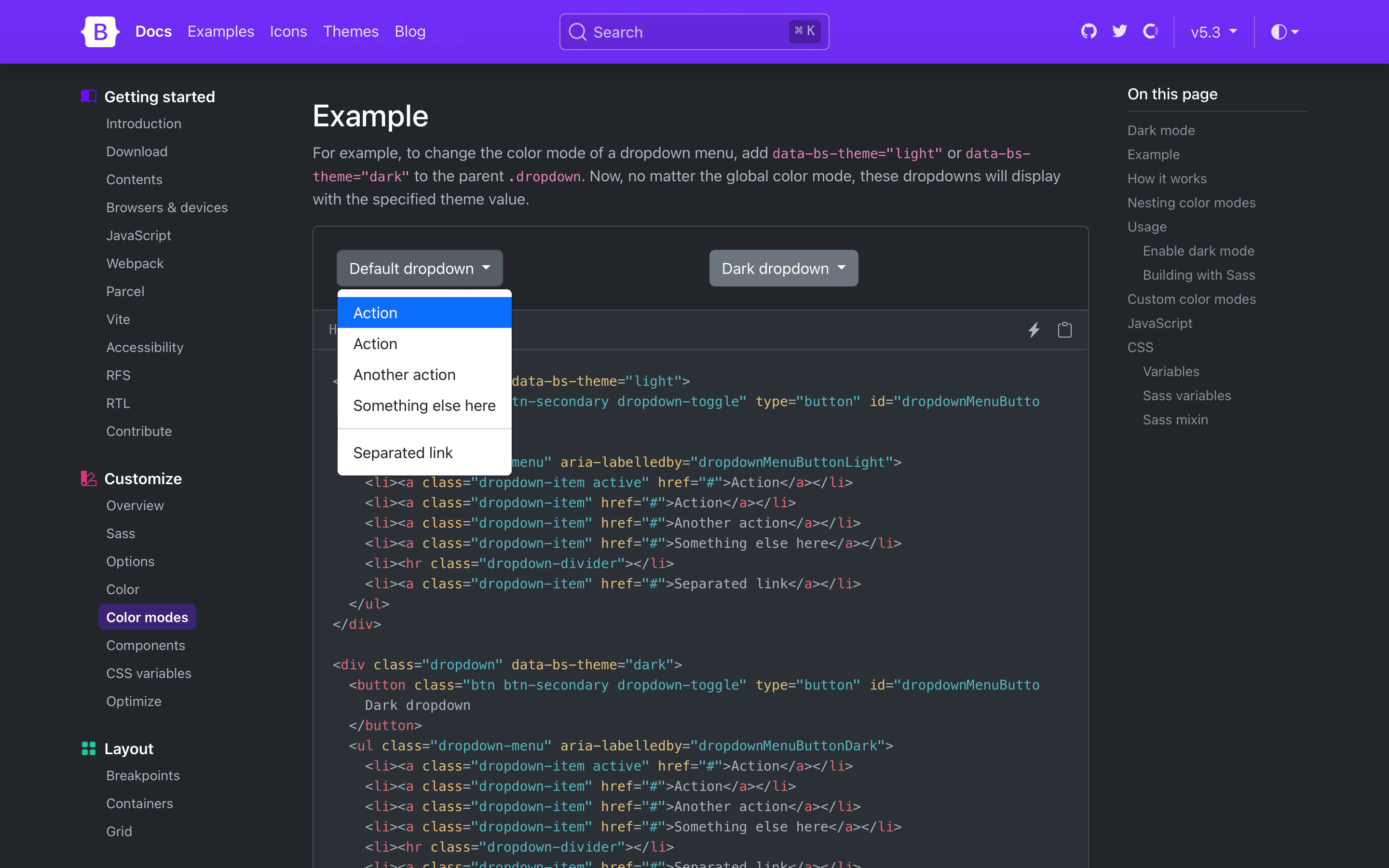
Need a more isolated dark mode? You can also set the color mode
on a parent element like the .dropdown shown below.
This will only affect the dropdown and its children instead of the
entire page.
<div class="dropdown" data-bs-theme="light">
  <button class="btn btn-secondary dropdown-toggle" type="button" id="dropdownMenuButtonLight" data-bs-toggle="dropdown" aria-expanded="false">
    Default dropdown
  </button>
  <ul class="dropdown-menu" aria-labelledby="dropdownMenuButtonLight">
    <li><a class="dropdown-item active" href="#">Action</a></li>
    <li><a class="dropdown-item" href="#">Action</a></li>
    <li><a class="dropdown-item" href="#">Another action</a></li>
    <li><a class="dropdown-item" href="#">Something else here</a></li>
    <li><hr class="dropdown-divider"></li>
    <li><a class="dropdown-item" href="#">Separated link</a></li>
  </ul>
</div>

<div class="dropdown" data-bs-theme="dark">
  <button class="btn btn-secondary dropdown-toggle" type="button" id="dropdownMenuButtonDark" data-bs-toggle="dropdown" aria-expanded="false">
    Dark dropdown
  </button>
  <ul class="dropdown-menu" aria-labelledby="dropdownMenuButtonDark">
    <li><a class="dropdown-item active" href="#">Action</a></li>
    <li><a class="dropdown-item" href="#">Action</a></li>
    <li><a class="dropdown-item" href="#">Another action</a></li>
    <li><a class="dropdown-item" href="#">Something else here</a></li>
    <li><hr class="dropdown-divider"></li>
    <li><a class="dropdown-item" href="#">Separated link</a></li>
  </ul>
</div>
New color-mode() mixin
Dark mode styles are written with and generated through the new
color-mode() Sass mixin. The mixin
allows you to write styles specific to a particular color mode,
like dark mode.
@include color-mode(dark) {
  .element {
    color: var(--bs-primary-text-emphasis);
    background-color: var(--bs-primary-bg-subtle);
  }
}
Together with the new $color-mode-type Sass
variable, you can also change how color modes behave in Bootstrap.
The default value is data, which tells Bootstrap to
generate CSS selectors that scope the color mode’s styles to the
data attributes you’ve seen above.
The other supported value is media-query, which
generates media query selectors instead. This is helpful for those
who want light and dark modes, automatically, and without a user
override.
$color-mode-type: media-query;

@include color-mode(dark) {
  .element {
    color: var(--bs-primary-text-emphasis);
    background-color: var(--bs-primary-bg-subtle);
  }
}
Which outputs to:
@media (prefers-color-scheme: dark) {
  .element {
    color: var(--bs-primary-text-emphasis);
    background-color: var(--bs-primary-bg-subtle);
  }
}
Read the new color mode docs to learn more.
Toggling color modes
While we haven’t written a new JavaScript plugin for toggling
color modes, we’ve written a great script for toggling color modes via
data-bs-theme in our docs. Our implementation
defaults to a user’s operating system color mode (auto), but also
allows users to override that with a particular mode (light or
dark) that’s recorded in local storage for easy reference on future
page loads. You can use and adapt this script as needed.
New color mode variables
There’s also a new _variables-dark.scss stylesheet
that houses dark mode-specific Sass variables. This is where we
modify mostly global values, and some component-specific values,
for dark mode. We recommend creating separate Sass stylesheets for
additional custom color modes (e.g., a blue theme might have
_variables-blue.scss). We expect this stylesheet
to be simplified in our next major release as we continue to
streamline the code base.)
Dark mode colors are all derived from our theme colors, meaning
you can easily change the color mode palettes by updating the
original theme colors. This means we’re not using our already
tinted and shaded colors (e.g., shade-color($danger,
60%) instead of red-800 for the new danger
emphasis color).
Bootstrap v5.3.0 ships with dark mode enabled, but you can also
disable it by updating the boolean $enable-dark-mode
Sass variable.
Read more in the new color mode docs.
Enabling dark mode
If you’re using the CDN or starter template, using the new color
modes is straightforward. Add the data-bs-theme
attribute with light or dark values to
the <html> element and you’ll be using either
the light or dark theme.
<!doctype html>
<html lang="en" data-bs-theme="dark">
  <head>
    <meta charset="utf-8">
    <meta name="viewport" content="width=device-width, initial-scale=1">
    <title>Bootstrap demo</title>
    <link href="https://cdn.jsdelivr.net/npm/bootstrap@5.3.0/dist/css/bootstrap.min.css" rel="stylesheet" integrity="sha384-9ndCyUaIbzAi2FUVXJi0CjmCapSmO7SnpJef0486qhLnuZ2cdeRhO02iuK6FUUVM" crossorigin="anonymous">
  </head>
  <body>
    <h1>Hello, world!</h1>
    <script src="https://cdn.jsdelivr.net/npm/bootstrap@5.3.0/dist/js/bootstrap.bundle.min.js" integrity="sha384-geWF76RCwLtnZ8qwWowPQNguL3RmwHVBC9FhGdlKrxdiJJigb/j/68SIy3Te4Bkz" crossorigin="anonymous"></script>
  </body>
</html>
Custom color modes
When we set out to add dark mode support to Bootstrap, we didn’t
want to just add a dark mode. We wanted to build the foundations
for a color mode system that could be used to create any number of
themes and color modes. That’s why we lead with the
data-bs-theme attribute and the new
color-mode() Sass mixin, and why we’ve added so many
new CSS variables in these latest releases.
To add a custom color mode, create your own
data-bs-theme selector with a custom value as the name
of your color mode, then modify any Sass and CSS variables as
needed. We created a separate _variables-dark.scss
stylesheet to house Bootstrap’s dark mode-specific Sass variables,
but that’s not required for you.
For example, you can create a “blue theme” with the selector
data-bs-theme="blue". In your custom Sass or CSS file,
add the new selector and override any global or component CSS
variables as needed. If you’re using Sass, you can also use Sass’s
functions within your CSS variable overrides.
Heads up! Applying color modes to elements that aren’t the
<html> or <body> elements
requires classes like .text-body and
.bg-body. This is because many HTML elements have no
set color or background to style until
you add them yourself. We’ve included them here for you just in
case.
[data-bs-theme="blue"] {
  // CSS variable overrides and styles
}
<div data-bs-theme="blue">
  ...
</div>
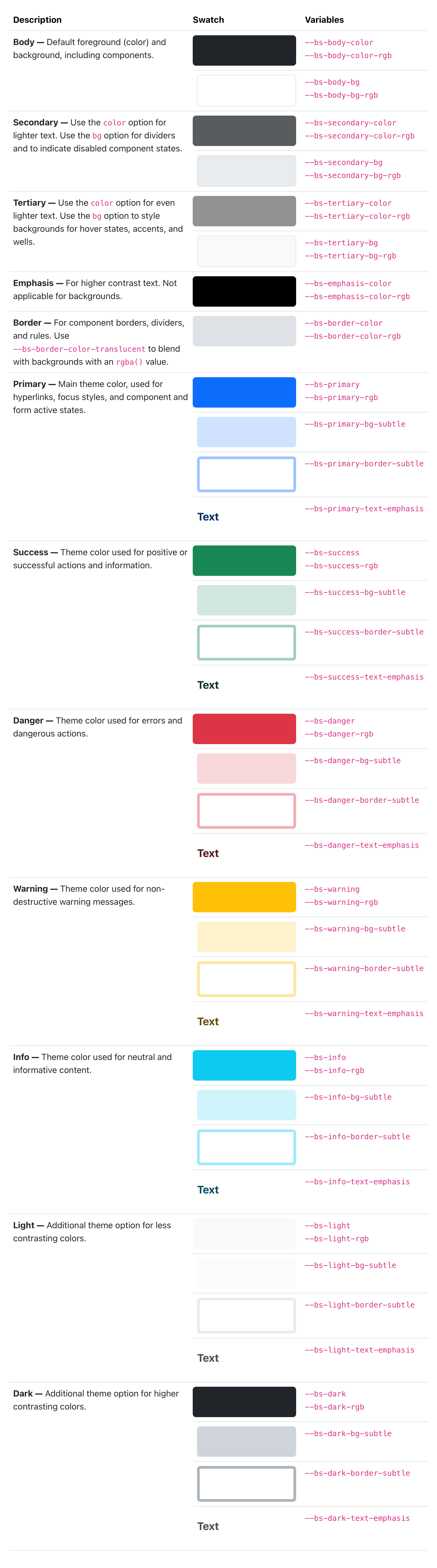
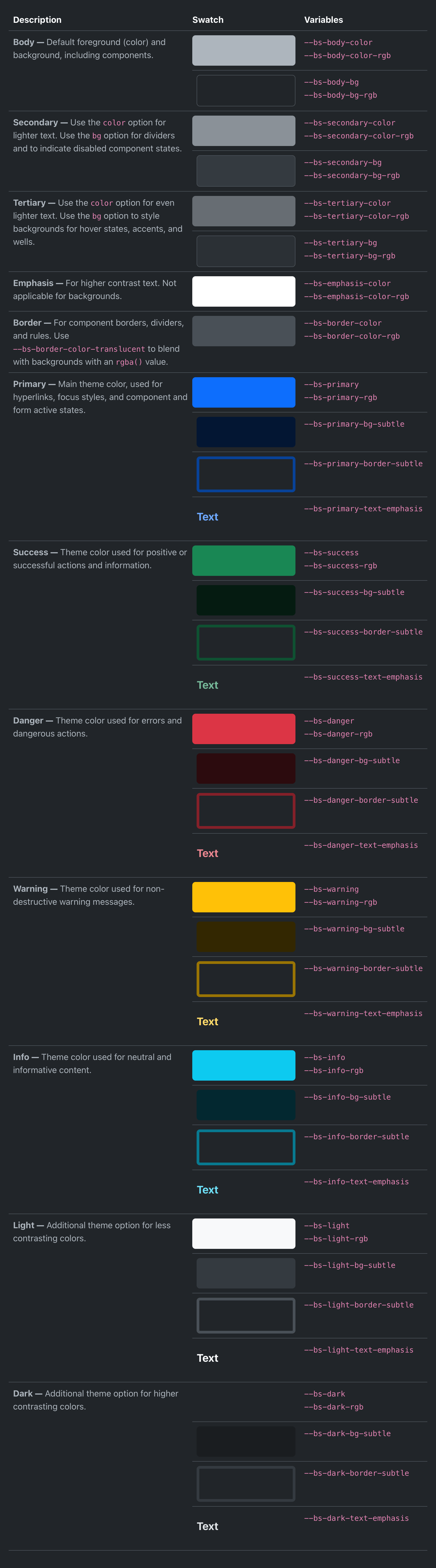
Refreshed color palette
We’ve revamped our color palette to include all new Sass
variables, CSS variables, and utilities for setting
color, background-color, and
border-color. Our foreground and background colors
have been expanded to include new secondary, tertiary, and emphasis
colors, while our theme colors have been expanded on to include
their subtle background colors, subtle border colors, and darker
text colors.
Check out the new colors docs.
We’ve rebuilt some components (like list groups and alerts) to use these new variables in their source Sass and compiled CSS so that they respond to the color mode changes.
New link helpers and utilities
Link styling has infinitely better in v5.3.0 with a slew of all-new link helpers and utilities. First up, we’ve added styles to place icons like Bootstrap Icons alongside links with the new icon link helper.
Icon link html<a class="icon-link" href="#">
<svg class="bi" aria-hidden="true"><use xlink:href="#archive"></use></svg>
Icon link
</a><a class="icon-link" href="#">
Icon link
<svg class="bi" aria-hidden="true"><use xlink:href="#arrow-right-short"></use></svg>
</a>Our other new helper is a new focus ring helper for removing the default
outline and setting a custom box-shadow
focus ring.
<a href="#" class="d-inline-flex focus-ring py-1 px-2 text-decoration-none border rounded-2">
  Custom focus ring
</a>
On the utilities side, we have new classes for setting link color opacity, underline offset, underline color, and underline opacity. Explore the new links utilities.
<p><a class="link-opacity-10" href="#">Link opacity 10</a></p>
<p><a class="link-opacity-25" href="#">Link opacity 25</a></p>
<p><a class="link-opacity-50" href="#">Link opacity 50</a></p>
<p><a class="link-opacity-75" href="#">Link opacity 75</a></p>
<p><a class="link-opacity-100" href="#">Link opacity 100</a></p>
<p><a href="#">Default link</a></p>
<p><a class="link-offset-1" href="#">Offset 1 link</a></p>
<p><a class="link-offset-2" href="#">Offset 2 link</a></p>
<p><a class="link-offset-3" href="#">Offset 3 link</a></p>

<p><a href="#" class="link-success link-offset-2 link-underline-opacity-25 link-underline-opacity-100-hover">Custom link</a></p>
Lastly, we’ve added a new .link-body-emphasis
helper alongside our colored links. This creates a colored link using our
color mode responsive emphasis color.
<p><a href="#" class="link-body-emphasis link-offset-2 link-underline-opacity-25 link-underline-opacity-75-hover">Emphasis link</a></p>
New nav underline
There’s a new .nav variant and modifier class with
.nav-underline. Add .nav-underline to a
.nav to get a simpler bottom border under the active
nav link. See the docs for an example.
<ul class="nav nav-underline">
  <li class="nav-item">
    <a class="nav-link active" aria-current="page" href="#">Active</a>
  </li>
  <li class="nav-item">
    <a class="nav-link" href="#">Link</a>
  </li>
  <li class="nav-item">
    <a class="nav-link" href="#">Link</a>
  </li>
  <li class="nav-item">
    <a class="nav-link disabled">Disabled</a>
  </li>
</ul>
And much more!
Beyond all the color mode updates, new helpers, and new utilities, we have a ton of other quality-of-life updates in this release. Here’s a quick rundown of the highlights:
-
Navs now have new
:focus-visiblestyles that better match our custom button focus styles. -
CSS variable-based
border-widthutilities have been reverted to set their property directly (as was done before v5.2.0). This avoids inheritance issues across nested elements, including tables. -
Added new
.border-blackutility to match our.text-blackand.bg-blackutilities. -
Deprecated the
.text-mutedutility and$text-mutedSass variable. It’s been replaced by.text-body-secondaryand$body-secondary-color. -
Added a check for interpolated variables to catch compilation errors with Node Sass when using Sass variables in
calc()functions. -
Started using
--bs-border-radiusvariables across more components. -
Added
.d-inline-gridutility class. -
Fixed
.tooltip-innerplacement when using variations infallbackPlacements. -
Fix selectors for dark mode carousel overrides when compiling with
$color-mode-type: media-query. -
Updated the styling of floating labels when “floated” to include a
background-colorto help with multiple lines of text intextareas. This also fixes the colors when form elements are disabled in floating forms. -
Updated RFS to v10.0.0.
Next up
We’ll be shipping some patch releases for v5.3.x in the coming weeks to address any issues that come up. We’ll also be working on v5.4.0, which will primarily focus on improvements to our utilities API and related code. Stay tuned for more updates on that front!
Migrating from earlier alphas
Have a read through the Migration guide for the first alpha, or the blog post for the release announcement, if you’re just getting into v5.3.0.
Get the release
Head to https://getbootstrap.com for the latest. It’s also been pushed to npm:
npm i bootstrap@v5.3.0
Read the GitHub v5.3.0 changelog for a complete list of changes in this release.
Support the team
Visit our Open Collective page or our team members’ GitHub profiles to help support the maintainers contributing to Bootstrap.
Read more https://blog.getbootstrap.com/2023/05/30/bootstrap-5-3-0/