- Details
- Category: Dev News

Statamic's Flat Camp is an unforgettable, relationship-focused retreat for the Statamic and Laravel community. Happening June 11-14, 2024, and set in the idyllic Italian countryside, right outside Rome, surrounded by beautiful scenery, we talk both business and non-business.
Spend time with the gentlemen from the Statamic Core team, meet those lovely people from the community IRL, influence the future roadmap, and talk about operating your freelance or agency business to peers, all while sitting by the pool, having lunch or dinner cooked by a private chef, and more! It's a different experience compared to a regular conference you might have attended in the past. You won't need a hotel since the accommodation is included in the ticket as well. This is all part of the experience.
Read the recap of last year's retreat over on the Statamic blog or relive some of the magic by watching the recap video.
<iframe width="939" height="528" src="https://www.youtube.com/embed/x1kzmJFGTJA" title="Flat Camp 2023" frameborder="0" allow="accelerometer; autoplay; clipboard-write; encrypted-media; gyroscope; picture-in-picture; web-share" allowfullscreen></iframe>It truly was a unique get-together last year.

Still need convincing after watching that recap video? Let Jack, founder of Statamic, tell you why you (and/or your colleagues) should come.
<iframe width="939" height="528" src="https://www.youtube.com/embed/RHttx8q1VOk" title="Why you should come to Flat Camp – The Statamic Non-Conf" frameborder="0" allow="accelerometer; autoplay; clipboard-write; encrypted-media; gyroscope; picture-in-picture; web-share" allowfullscreen></iframe>Flat Camp is limited to 50 guests and a ticket includes:
- 3 Nights lodging in our own private Italian villa
- Private chef will prepare us breakfast, lunch, and dinner
- Access to all workshops, intimate talks, and wine cellar chats
- Exclusive Statamic/Flat Camp swag
- Other mysteries and surprises
For complete details and tickets, head over to the Flat Camp site.
The post Statamic announces next Flat Camp retreat (EU edition) appeared first on Laravel News.
Join the Laravel Newsletter to get all the latest Laravel articles like this directly in your inbox.
Read more https://laravel-news.com/statamic-eu-flat-camp
- Details
- Category: Dev News
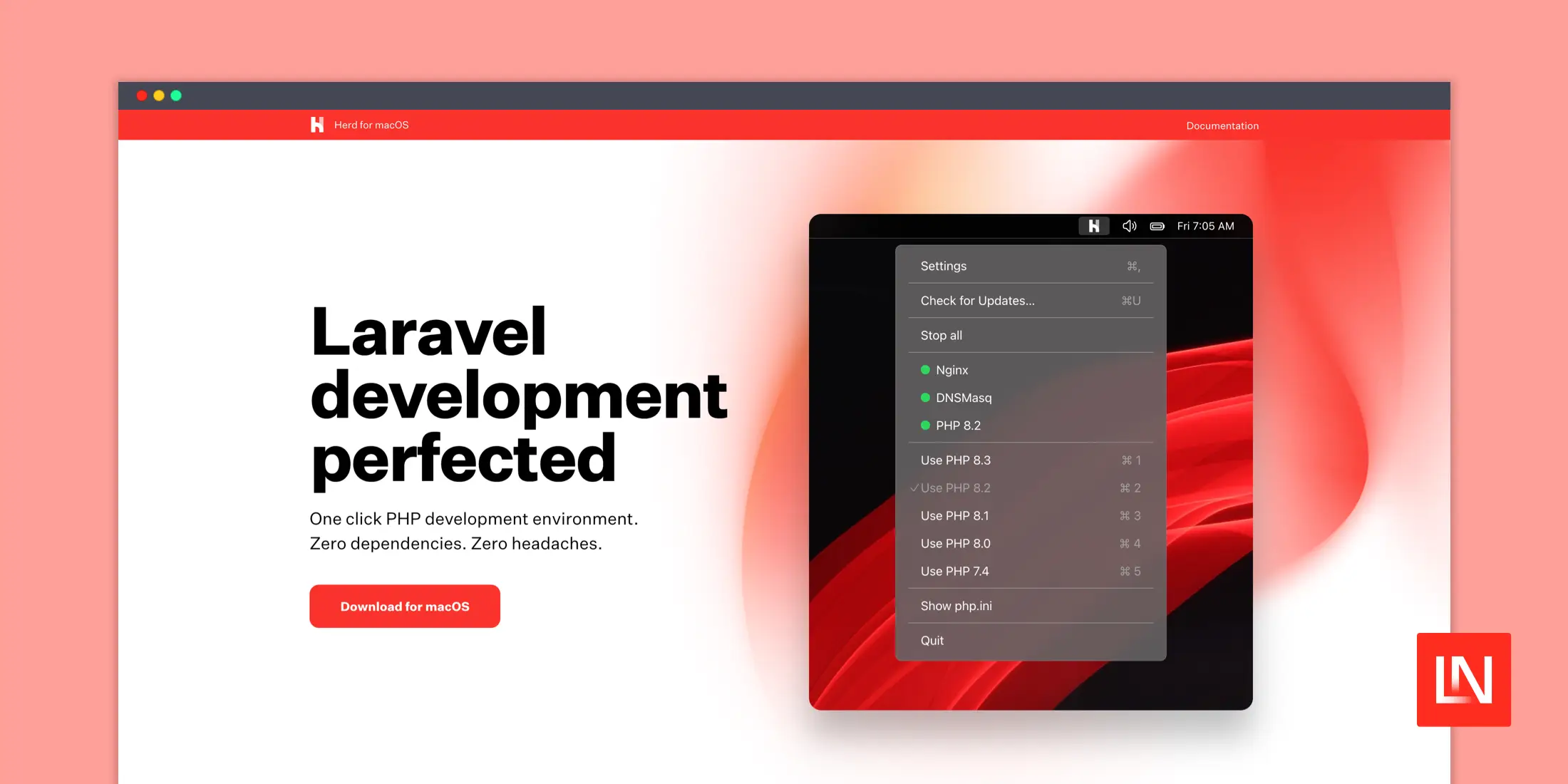
Laravel Herd v1.5 introduces an exciting new pro feature: services.
You can easily create and manage all your local development services inside of Herd, such as databases, cache (Redis 7.0), queues (Redis 7.0), search services, S3 storage (MinIO), and real-time services like Laravel Reverb.

Herd manages all these services without running via Docker, Homebrew services, etc. It also provides all the configuration and logging you'll need to set up and monitor your services to configure your app. For details, read up on Herd Pro Services in the official documentation.
We are seeing a lot of praise for Herd Pro's services simplifying the setup of local Laravel Development environments! Herd is currently available on macOS and Herd for Windows is planned to be released later in March 2024; stay tuned!
To use services in Laravel Herd, grab Herd Pro today!
The post Laravel Herd releases v1.5.0 with new services. No more Docker, DBNGIN, or even homebrew! appeared first on Laravel News.
Join the Laravel Newsletter to get all the latest Laravel articles like this directly in your inbox.
Read more https://laravel-news.com/laravel-herd-1-5
- Details
- Category: Dev News
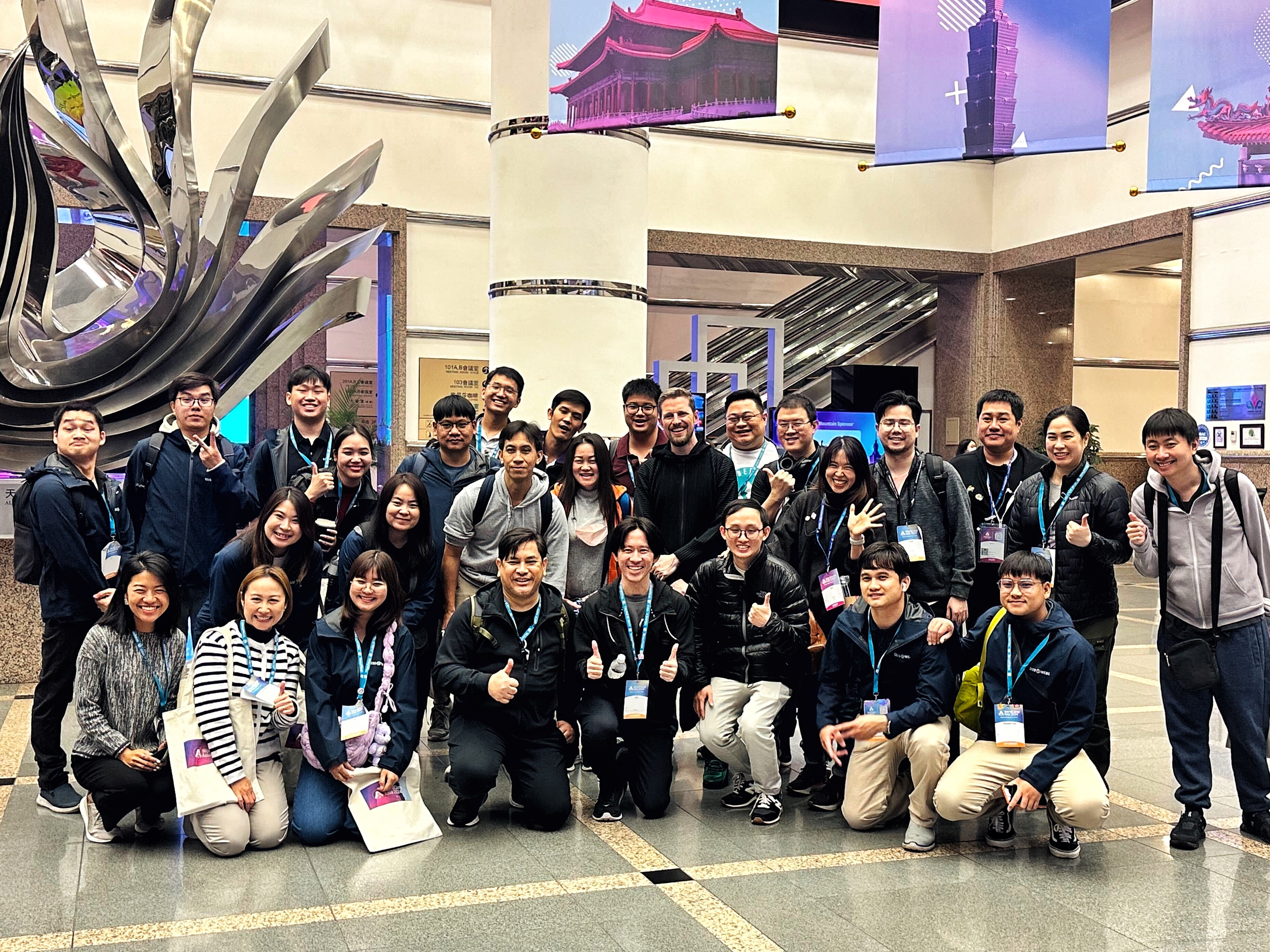
This year’s WordCamp Asia was held in Taipei, the vibrant capital city of Taiwan. Members from WordPress.com joined other Automatticians, as well as around 2,000 other attendees from across 70 countries to connect, learn, build, and give back to the platform that powers millions of top websites across the internet.
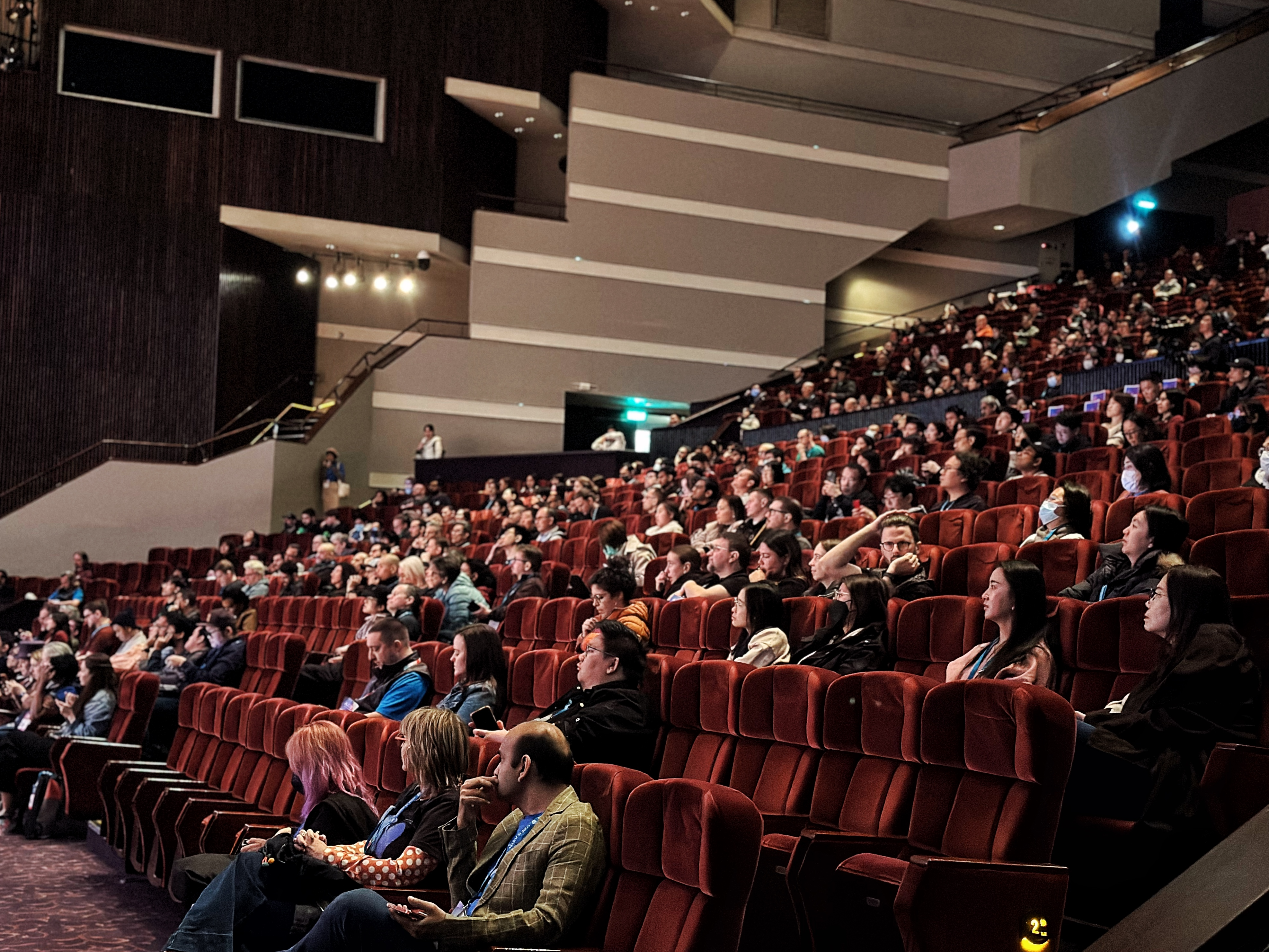
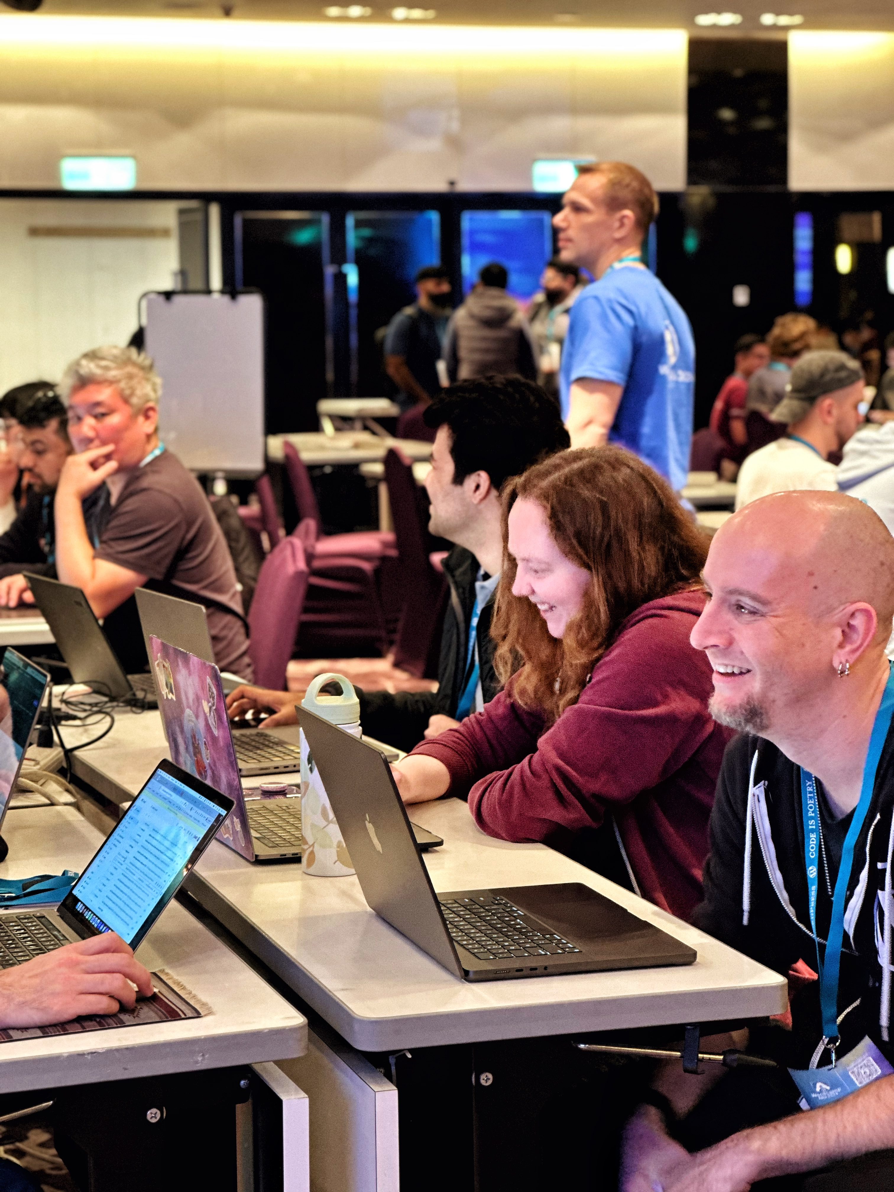
The event kicked off with Contributor Day, an opportunity for anyone in the WordPress community, from newcomers to seasoned experts, to get involved and contribute to WordPress. Contributing can mean contributing to code, but it can also mean sharing your expertise in design, offering support in forums, translating content, and much much more. This year’s Contributor Day had a fantastic turnout and it was amazing to see so many folks show up and participate!
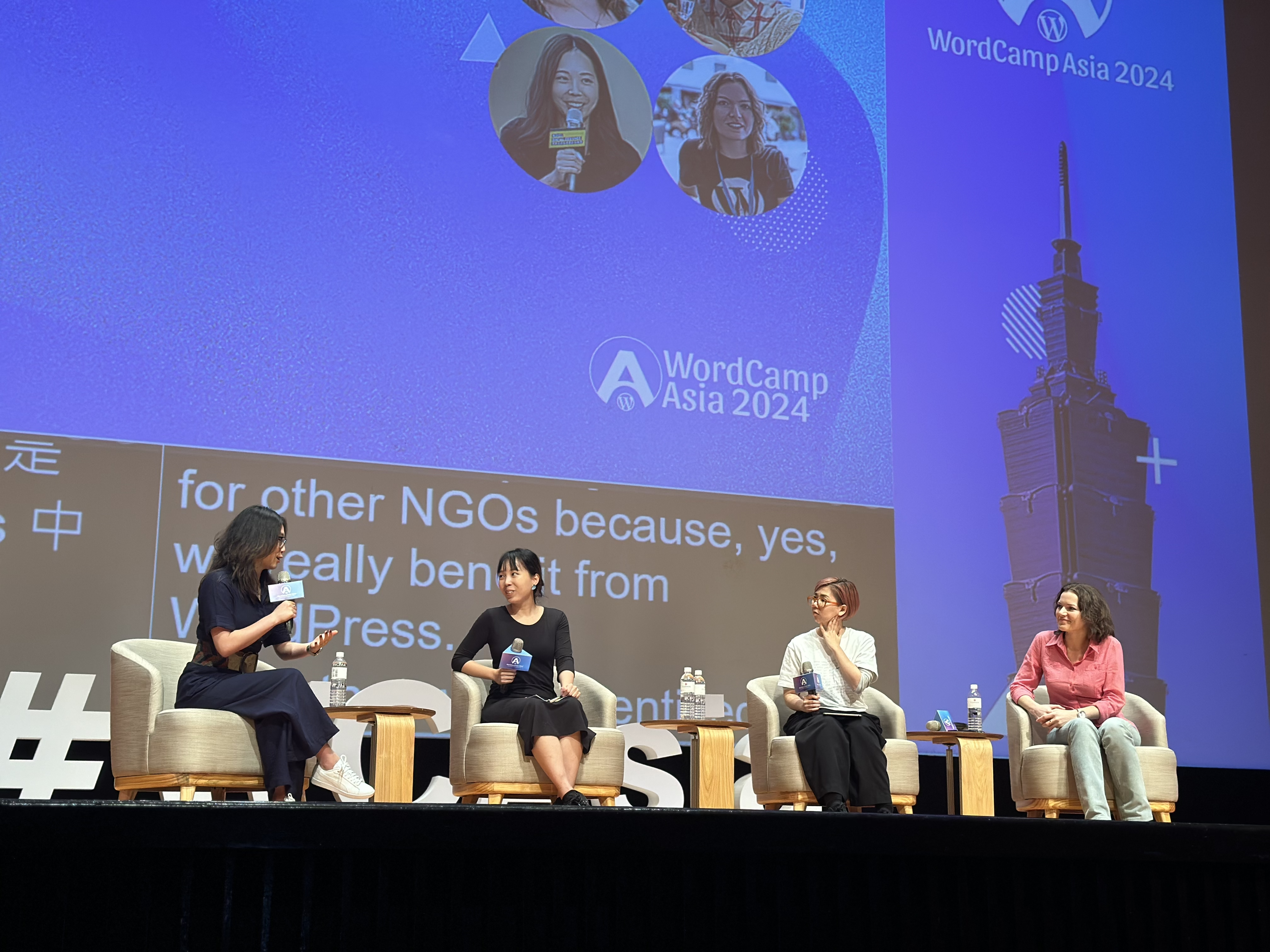
As always, there was a variety of informative and inspiring talks. Some of our favorites included talks about the future of WordPress, the multifaceted nature of design, building and maintaining WordPress sites with AI, achieving efficient workflows with the site editor, and the importance of diversity, equity, inclusion, and belonging in the tech and WordPress communities. If any of these topics pique your interest, you can take a look at the livestream recordings for these and all other WordCamp Asia 2024 talks here.
While our colleagues from the WordPress Project, Woo, and Jetpack participated in the event, folks from WordPress.com were also present, contributing, networking, and engaging with the community.
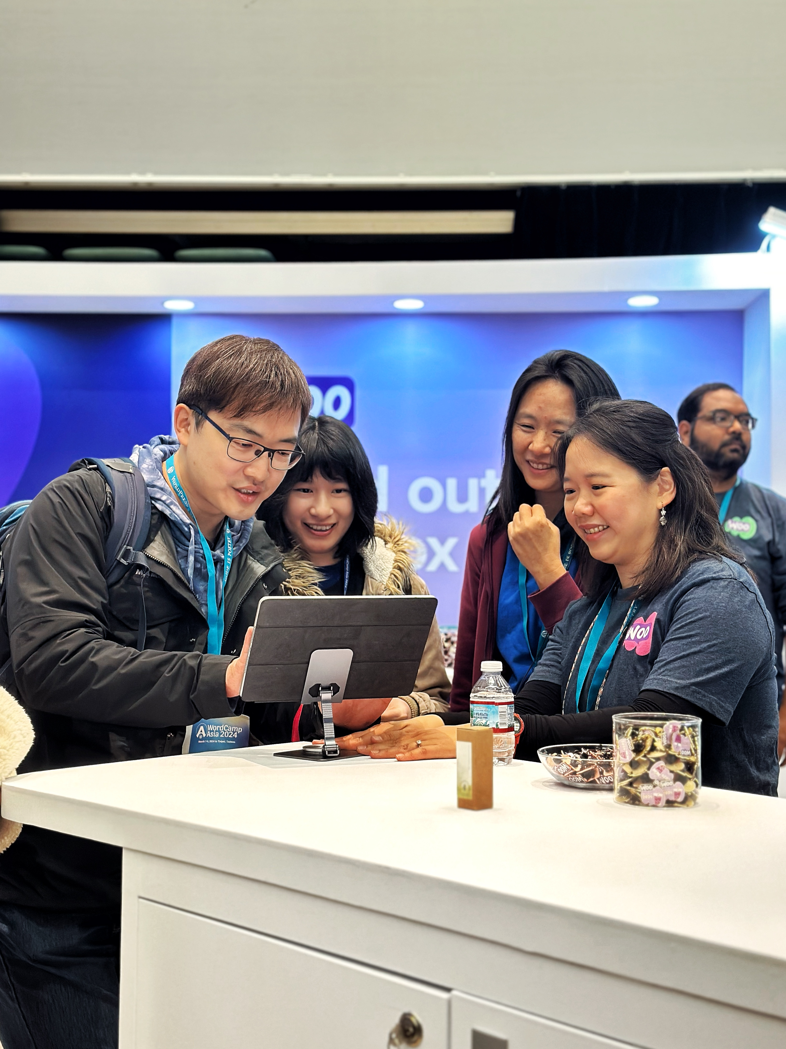
This year we were particularly interested in connecting with developers so that we could better understand their experiences with WordPress.com. Our hosting infrastructure, powered by WP Cloud, is best-in-class, yet the benefits aren’t as well-known in the developer community. To help get the word out about all of our developer-focused features, we’ve recently relaunched our developer site at developer.wordpress.com. Check it out to learn about staging sites, WP-CLI access, and Studio, our upcoming local development environment.
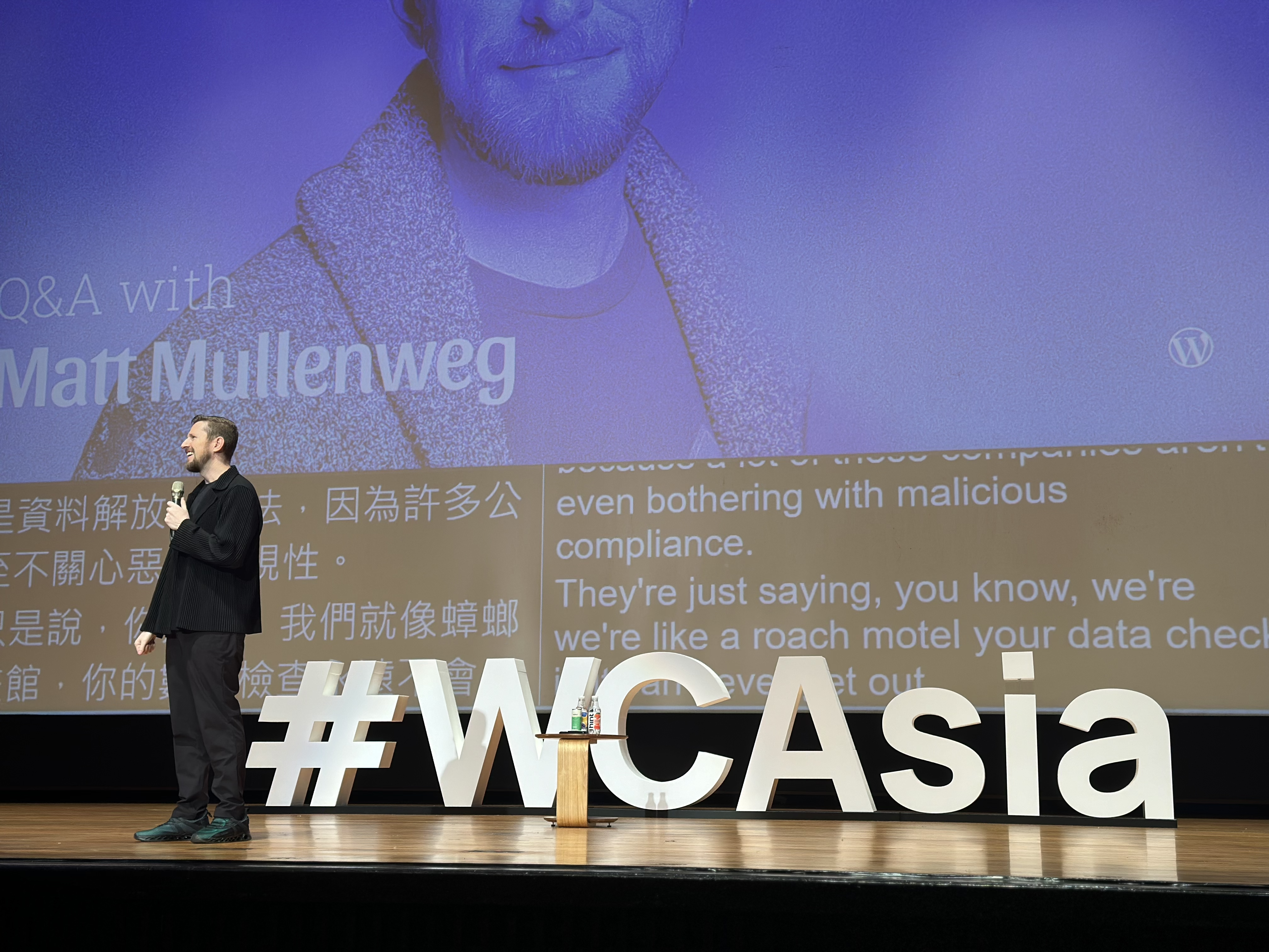
During the anticipated closing Q&A session at WordCamp Asia 2024, Matt Mullenweg, co-founder of WordPress and CEO of Automattic, opened up about his dreams for a web that’s both open and accessible to everyone. He shared how the core principles of open source are not just shaping WordPress but also knitting together a worldwide community of contributors.
That sense of community is something you can definitely feel at WordCamps. Thirty-six percent of attendees at this WordCamp were first-time participants—a testament to the event’s growing appeal and the ever-expanding WordPress community.
During the closing remarks, Matt revealed that State of the Word 2024 will be held in Tokyo, Japan. The lead organizers also revealed the next WordCamp Asia location: Manila, Philippines, in February 2025. With Manila’s rich tapestry of Spanish, European, American, and Asian influences, we’re in for a vibrant mix of culture, cuisine, and community!
But you don’t have to wait until 2025 to start getting involved. There’s a huge number of local and regional WordCamps happening year-round. Head over to https://central.wordcamp.org/ to find one near you. Whether you’re looking to develop your skills, learn something new, network with the community, there’s something for everyone. We hope to see you out there!
Read more https://wordpress.com/blog/2024/03/13/wordcamp-asia-2024/
- Details
- Category: Dev News
Now that Laravel 11 is out, we wanted to share some resources from the community for getting up-to-speed with Laravel 11. Whether you’re a seasoned Laravel developer or just stepping into the world of web development, we’ve hand-picked some content we think will help you get up to speed quickly:
Laravel 11 Highlights in 90 Seconds
If you’re already familiar with Laravel, we walk you through Laravel 11 highlights in 90 seconds:
<iframe width="560" height="315" src="https://www.youtube.com/embed/f41juaJMxKE?si=-pD8L-jK3TwyJ_41" title="YouTube video player" frameborder="0" allow="accelerometer; autoplay; clipboard-write; encrypted-media; gyroscope; picture-in-picture; web-share" allowfullscreen></iframe>Dive Into the Streamlined Directory Structure in Laravel 11
Our Dive into the Streamlined Directory Structure in Laravel 11 article walks you through the latest Laravel skeleton directory structure when setting up a new Laravel 11 application.
<iframe width="560" height="315" src="https://www.youtube.com/embed/lQSEBvxuXiU?si=gstIKUy4OLMao8Bg" title="YouTube video player" frameborder="0" allow="accelerometer; autoplay; clipboard-write; encrypted-media; gyroscope; picture-in-picture; web-share" allowfullscreen></iframe>Welcome to Laravel 11
Over on the official Laravel YouTube channel, Christoph Rumpel walks through new features that landed in this week’s Laravel 11 release:
<iframe width="560" height="315" src="https://www.youtube.com/embed/rmMCiP-iVYM?si=2rFDo4jOhx5fVZ6g" title="YouTube video player" frameborder="0" allow="accelerometer; autoplay; clipboard-write; encrypted-media; gyroscope; picture-in-picture; web-share" allowfullscreen></iframe>Laravel 11 is Here by Josh Cirre
Josh Cirre’s video Laravel 11 is Here (and I'm so excited) is another excellent roundup of high-level features released with Laravel 11:
<iframe width="560" height="315" src="https://www.youtube.com/embed/IEVufZPXzBo?si=fFvV8D37UWnpqB-F" title="YouTube video player" frameborder="0" allow="accelerometer; autoplay; clipboard-write; encrypted-media; gyroscope; picture-in-picture; web-share" allowfullscreen></iframe>Laracasts: 30 Days to Learn Laravel
Laracasts has updated their free Laravel course to Laravel 11, 30 Days to Learn Laravel. You’ll learn Laravel from scratch in one month, one video per day, and learn everything you need to start building Laravel apps. This is a free course that anyone can watch!

Laravel Reverb Documentation
Laravel Reverb, a first-party WebSocket server for Laravel applications, launched with Laravel 11 as well. The full documentation for getting started with Reverb is now available in the official documentation. It will walk you through installing, setting up, and running the Reverb server in production.
<iframe width="560" height="315" src="https://www.youtube.com/embed/TkYXIHgdrgA?si=lOlgORQ2yzpFSJ2y" title="YouTube video player" frameborder="0" allow="accelerometer; autoplay; clipboard-write; encrypted-media; gyroscope; picture-in-picture; web-share" allowfullscreen></iframe>The Laravel Reverb website is beautiful, so check it out for a quick overview of Reverb, along with links to the documentation.
Upgrade to Laravel 11 with Shift
You can automate the Upgrade of Laravel 10.x to Laravel 11.x with Laravel Shift. This is an amazing way to speed up the upgrade process and get those existing Laravel applications running on the latest version of Laravel.
Laravel News creator Eric Barnes demonstrates upgrading laravel-news.com to Laravel 11 using the amazing Shift service:
<iframe width="560" height="315" src="https://www.youtube.com/embed/Z6aY9FfY5eI?si=9hh-F5U_xj6kB-u2" title="YouTube video player" frameborder="0" allow="accelerometer; autoplay; clipboard-write; encrypted-media; gyroscope; picture-in-picture; web-share" allowfullscreen></iframe>The Laravel 11 shift includes streamlining your configuration files to their true customizations, consolidating service providers, getting your app to reflect the Laravel 11 application structure updates, and more.
Check out the Shift demo video for some additional insight.
Laravel 11 Documentation Prologue
Each Laravel release contains a Prologue section, which contains Release Notes, an Upgrade Guide, and a Contribution Guide. Using Laravel Shift is the best way to upgrade, but reading through the release notes and upgrade guide is an excellent way to familiarize yourself with changes to the latest Laravel version.
A quick way to stay current with Laravel releases is the laravelversions.com website (and their APIs) so that you always know where to go to find dates for release, end of bug fixes, and end of security updates for Laravel & PHP. Hat tip to Matt Stauffer, who helps maintain laravelversions.com and phpreleases.com.
At the time of release, here’s an updated support policy:

Learn More
On our Laravel News YouTube channel, we have a Laravel 11 playlist for everything we've published leading up to the release of Laravel 11. We’d love to hear what you’re building with Laravel!
The post Resources for Getting Up To Speed with Laravel 11 appeared first on Laravel News.
Join the Laravel Newsletter to get all the latest Laravel articles like this directly in your inbox.
Read more https://laravel-news.com/resources-for-getting-up-to-speed-with-laravel-11
- Details
- Category: Dev News
Jamie Marsland has been preaching the WordPress gospel for over a decade and has trained thousands of people on blocks, plugins, and more. Through his popular YouTube channel and hands-on courses, Jamie provides incredible tutorials and breaks down the most common misconceptions about building with WordPress.
We’re happy to share that WordPress.com is partnering with Jamie over the next few months to create a series of videos that will show you how to get the most out of your website experience. From exciting new feature announcements to handy tips and tricks to Jamie’s mind-blowing “website re-creations,” we promise you’ll learn something new in every video.
Starting later this week, you’ll see those videos posted to both our own YouTube channel as well as this blog. Stay tuned!
Read more https://wordpress.com/blog/2024/03/12/build-and-beyond-jamie-marsland/