- Details
- Category: Dev News
The WordPress.com team is always working on new design ideas to bring your website to life. Check out the latest themes in our library, including great options for gamers, writers, and anyone else who creates on the web.
All WordPress.com ThemesSpiel
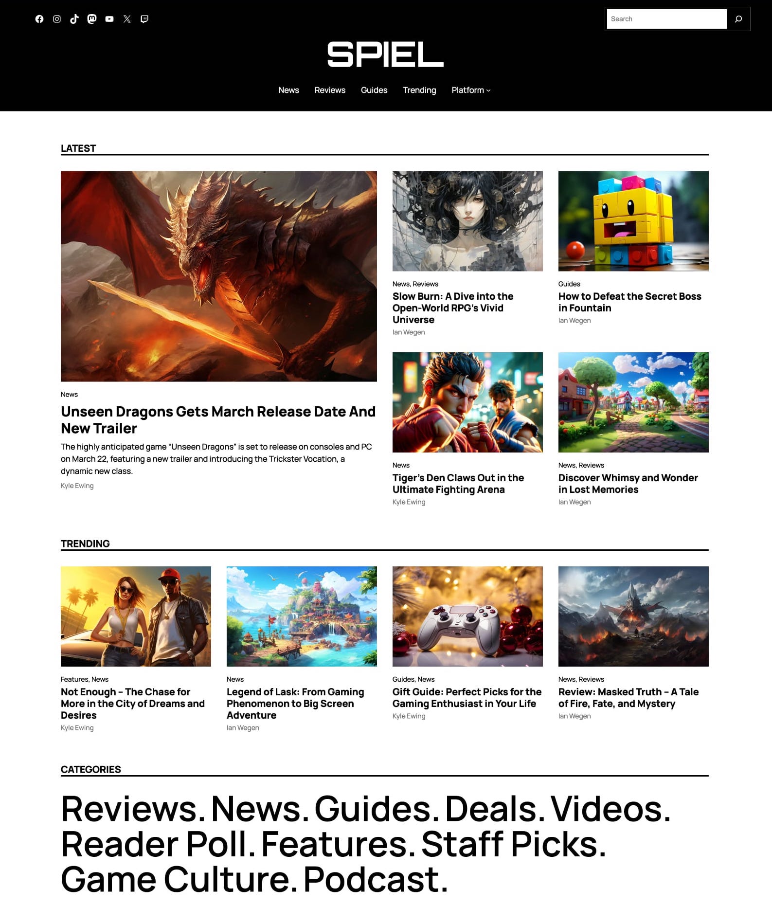
This magazine-style theme was built with gaming bloggers in mind, but is versatile enough to work exceptionally well for nearly any type of budding media empire. Using a classic blogging layout, we’ve combined modern WordPress technology—Blocks, Global Styles, etc.—with a nostalgic aesthetic that hearkens to the earlier days of the internet.
Click here to view a demo of this theme.
Allez
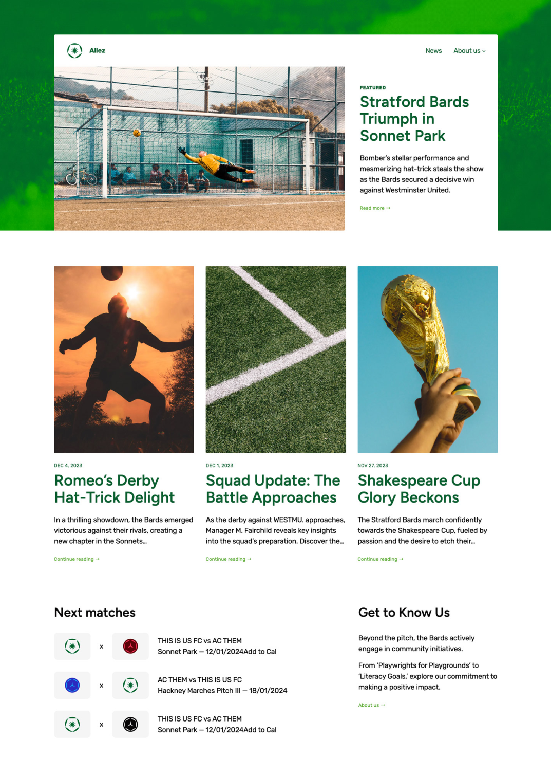
Whether you’re a casual observer or a diehard rain-or-shine follower, fandom means a lot of things to a lot of people. Allez is a perfect theme to chronicle that part of who you are. Built with sports-focused content in mind, the layout, styling, and patterns used all speak to that niche. That said, WordPress is versatile enough that if you like the overall feel of Allez, it can easily be customized to your particular endeavor.
Click here to view a demo of this theme.
Strand
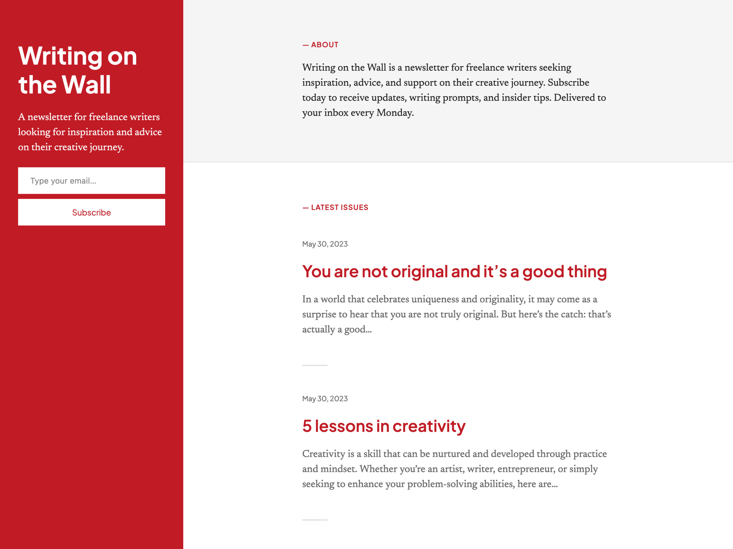
Strand is a simple newsletter and blogging theme with a split layout, similar to Poesis. We placed the newsletter subscription form in the sticky left column, so that it’s always visible and accessible. It’s a simple design, but one we really like for the minimalist writer who puts more emphasis on words than visual panache.
Click here to view a demo of this theme.
Bedrock
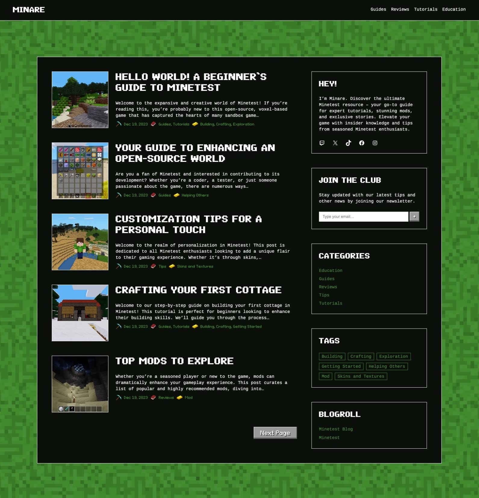
Inspired by the iconic worlds of Minecraft and Minetest (an open-source game engine), this blogging theme was designed to replicate the immersive experience of these games. While encapsulating the essence of virtual realms, we also wanted to ensure that the theme resonated with the Minecraft aesthetic regardless of the content it hosts.
At the heart of Bedrock is a nostalgic nod to the classic blog layout, infused with a distinctive “mosaic” texture. The sidebar sits confidently on every page and houses a few old-school elements like a tag cloud, a blogroll, and recent posts, all rendered with a touch of the game’s charm. If this theme speaks to you, give it a shot today.
Click here to view a demo of this theme.
Nook
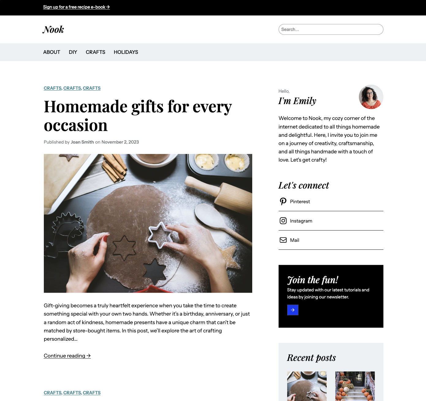
Nook is another blogging theme that offers a delightful canvas for your DIY projects, delicious recipes, and creative inspirations. It’s also easily extensible to add paid products or courses. Our aim here was to create an elegant and timeless look with a sense of warmth and familiarity. The typography and color palette feature high-contrast elements that evoke coziness and comfort.
Click here to view a demo of this theme.
To install any of the above themes, click the name of the theme you like, which brings you right to the installation page. Then click the “Activate this design” button. You can also click “Open live demo,” which brings up a clickable, scrollable version of the theme for you to preview.
Premium themes are available to use at no extra charge for customers on the Explorer plan or above. Partner themes are third-party products that can be purchased for $79/year each.
You can explore all of our themes by navigating to the “Themes” page, which is found under “Appearance” in the left-side menu of your WordPress.com dashboard. Or you can click below:
All WordPress.com ThemesRead more https://wordpress.com/blog/2024/02/22/wordpress-themes-february-24/
- Details
- Category: Dev News
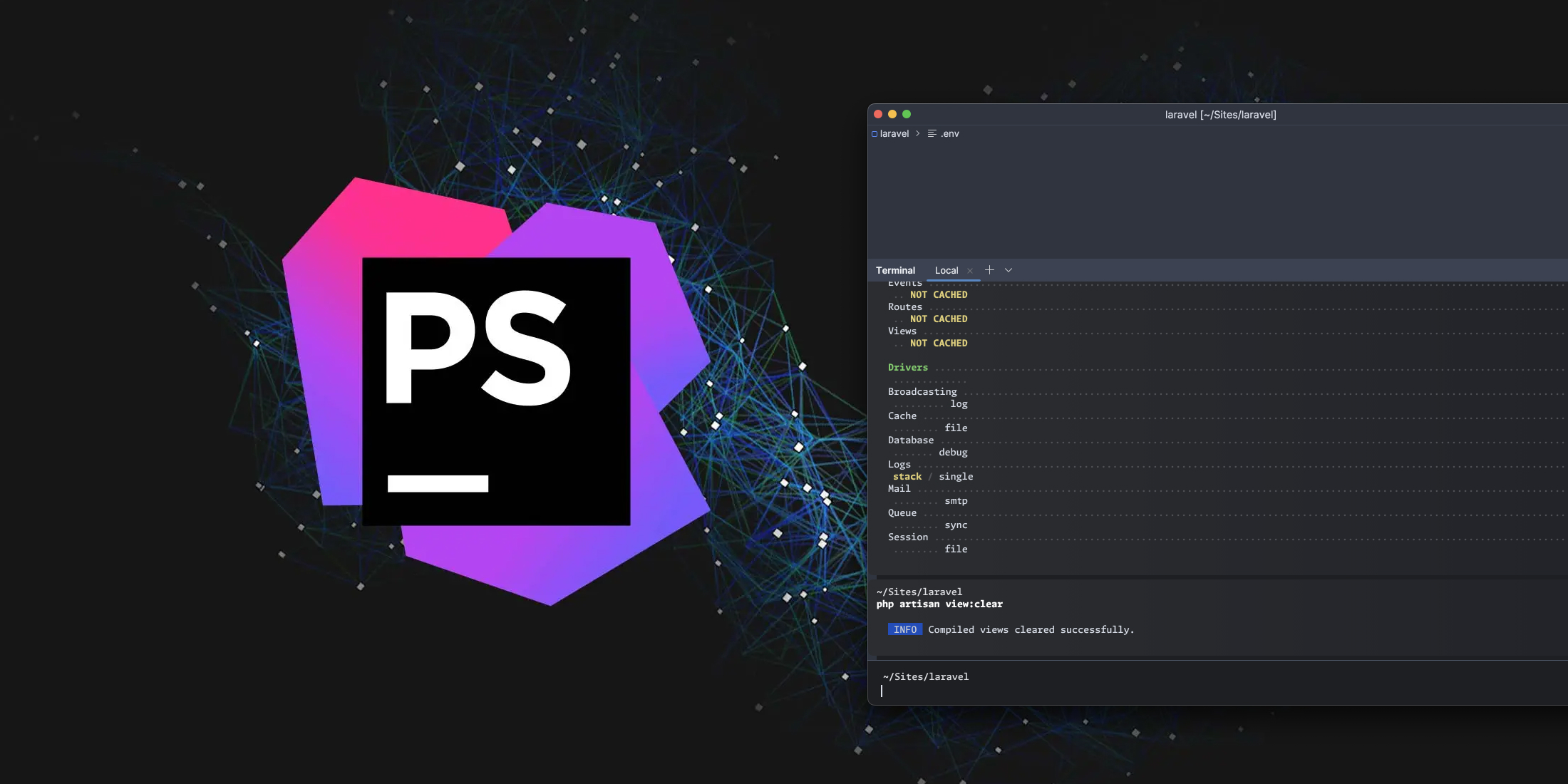
Coming to PhpStorm 2024.1 is a new redeveloped terminal that includes everything from visual changes to each ran command being put in its own block, new command history, and more.
Some of the highlights of the terminal include:
- Visual changes with each command output separate blocks
- Easy navigation between blocks using arrows and the ⌘↑ / ⌘↓ (macOS) and Ctrl+↑ / Ctrl+↓ (Windows and Linux)
- Command completion feature that supports commands, paths, arguments, and options, aimed at simplifying command entry
- A new command history
You can see the new features in the demo video above or check out the Jetbrains announcement
The post PhpStorm is getting a brand new terminal appeared first on Laravel News.
Join the Laravel Newsletter to get all the latest Laravel articles like this directly in your inbox.
Read more https://laravel-news.com/phpstorm-new-terminal
- Details
- Category: Dev News

We've created a collection of essential plugins for Visual Studio Code that will supercharge your coding experience. I’ve gathered my favorite extensions to make you a more productive PHP developer and even threw in my favorite theme for VS Code.
Let’s dive in!
Laravel Blade Formatter
The Laravel Blade formatter is an opinionated Blade file formatter for VS Code. This extension uses the shufo/blade-formatter NPM package that you can use to format Blade template files programmatically.

Another alternative is the shufo/prettier-plugin-blade if you’d rather use the Prettier formatter instead. VS Code has a Prettier plugin that you can use to incorporate this workflow on save. The VSCode section of the readme has setup instructions if you want to go this route.
Codeium: AI Autocomplete and Chat
Codeium is a free AI Code Completion and Chat tool comparable to GitHub copilot. It offers autocomplete and is available for several editors, including Visual Studio Code. It supports 70+ programming languages, including JavaScript, TypeScript, PHP, and more. You can also use the IDE-integrated chat to avoid leaving VS Code to ask questions or explain things.

You can grab this plugin for VS Code on the Visual Studio Code Marketplace.
Monokai Pro Theme
The Monokai Pro theme is my favorite theme for Visual Studio code. While you can freely evaluate it (with occasional popups), it requires a paid license for €12.5 ($13.53 USD at the time of writing), which is well worth the effort that went into designing these themes.

Monokai Pro includes six theme variations (Octagon is my favorite), has stylish file icons, contains various configuration options, and should fit almost any style you prefer in a dark theme.
You can grab a license on the Monokai Pro website, and the extension is available on the Visual Studio Marketplace.
PHP Intelephense
The PHP Intelephense extension gives you code intelligence for PHP in Visual Studio Code. If you are a newcomer to PHP or Laravel or a seasoned PHP developer jumping into VS Code for the first time, I recommend installing this extension. It includes code intelligence, symbol searching, go-to definition, documentation help, and a host of other features.

Intelephense offers a premium license that you can grab on intelephense.com that unlocks features like code renaming, code folding, "find all" implementations, "go to type definitions," and more.
Better PHPUnit
Better PHPUnit is a test runner for Visual Studio Code that supports running tests from your editor in the embedded terminal. This extension also supports Running Pest Tests, which gives you one test runner to support any PHP testing workflow.

You can install this extension within VS Code or grab it from the Visual Studio Marketplace.
Tailwind CSS IntelliSense
The Tailwind CSS IntelliSense extension gives you intelligent Tailwind CSS tooling for VS Code. This extension makes you more productive with Tailwind by providing advanced features such as autocomplete, syntax highlighting, and linting. You can also quickly see the complete CSS for a Tailwind class name by hovering over it:

You can find this extension by searching for “Tailwind CSS IntelliSense” or getting it directly from the Visual Studio Marketplace.
That’s a wrap on our essential plugins for VS Code users. I hope you've found something useful to improve your VS Code development! We can't share every single extension, so let us know your favorite VS Code extension or theme!
The post Six Essential Plugins for Visual Studio Code appeared first on Laravel News.
Join the Laravel Newsletter to get all the latest Laravel articles like this directly in your inbox.
Read more https://laravel-news.com/essential-extensions-for-vs-code-users
- Details
- Category: Dev News
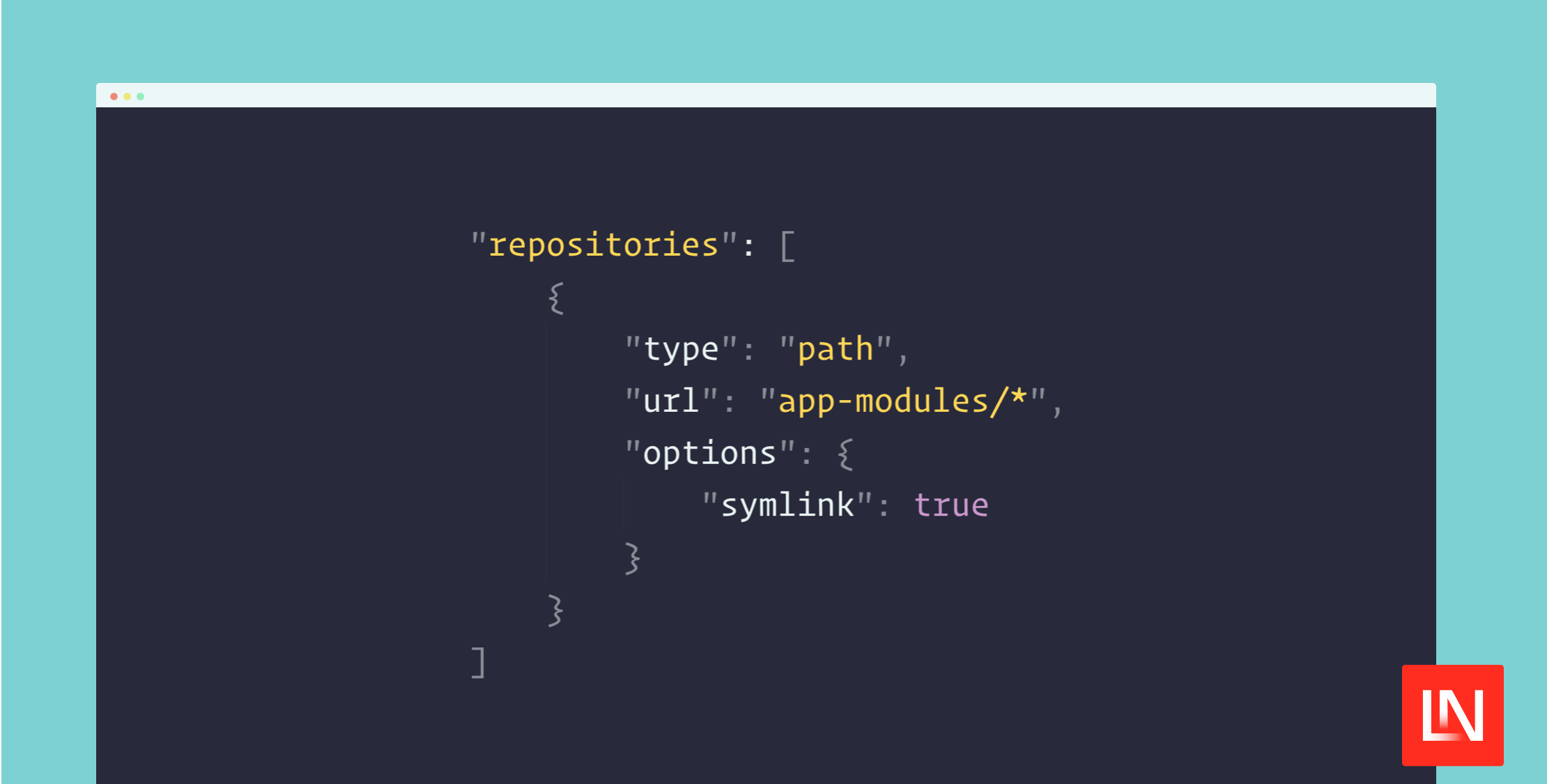
The InterNACHI/modular package is a module system for Laravel applications for features you want to build modularly. This package provides convenience commands and tools that aid you in creating modules within your Laravel application.
Once you install this package in your Laravel application, creating a module is as easy as running the following Artisan command, which will walk you through the setup process:
php artisan make:module teams

# Use existing Laravel commands with a new `--module` flag
php artisan make:controller ExampleController --module=teams
It has the following features that make breaking up your code into modules easy yet still keeping Laravel conventions:
- Create new Laravel modules via an Artisan command
- Module autoloading via Composer
- Laravel provider and alias discovery via Composer
- Customizable configuration/conventions around modules
- Commands are auto-registered with Artisan
- The migrator automatically runs migrations
- Model policies are auto-discovered
- Blade components are auto-discovered
- Event listeners are auto-discovered
- Artisan
make:*commands for your modules - And more…
This package doesn’t prescribe what code belongs in a module vs.
app/ code but does allow you to draw on Laravel
conventions even as you build separate modules. You can easily
extract module code into a separate Laravel package. I like this
approach as it lets you quickly create reusable module code without
fully committing to a separate package.
Learn More
This package is available on GitHub at InterNACHI/modular, including installation instructions and documentation in the project’s README. If you’re more of a visual person, package author Chris Morrell has a walkthrough video that covers how to use this package and the thought process behind it.
The post Modularize Your Laravel Application With the Modular Package appeared first on Laravel News.
Join the Laravel Newsletter to get all the latest Laravel articles like this directly in your inbox.
Read more https://laravel-news.com/laravel-modular-package
- Details
- Category: Dev News
The WordPress project team is continuously improving the Site Editor—your one-stop shop for editing and designing your site.
The latest batch of updates—Gutenberg 17.4 and 17.5—include a handful of small but powerful changes designed to improve both your WordPress experience and that of your site’s visitors.
Let’s take a look at what’s new.
More robust style revisions
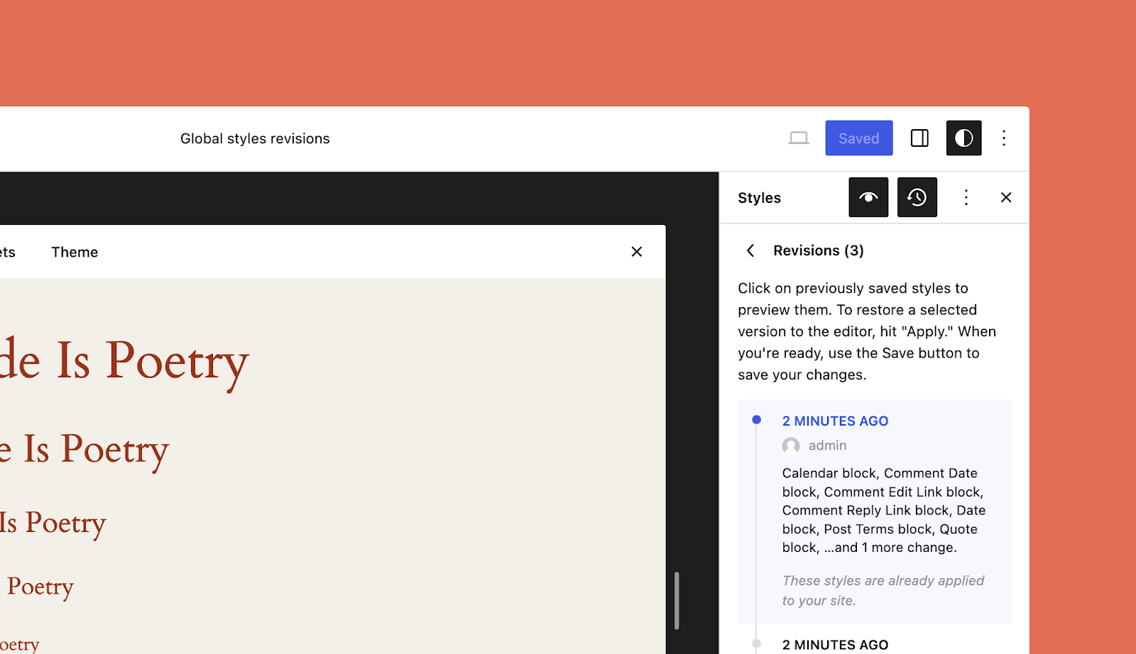
When you’re in the zone making changes to the look and feel of your site, you sometimes hit a dead end or realize that the version you had three or four font and color tweaks ago was a bit better. The updated style revisions pane gives you a robust, detailed log of the design changes you’ve made and makes turning back the clock easier with a one-click restore option to take you back to that perfect design.
Newly added pagination and more granular details make this feature even more powerful.
You can access style revisions from the Site Editor by clicking the “Styles” icon on the top right of the page, and then clicking the “Revisions” clock icon.
Unified preferences panel
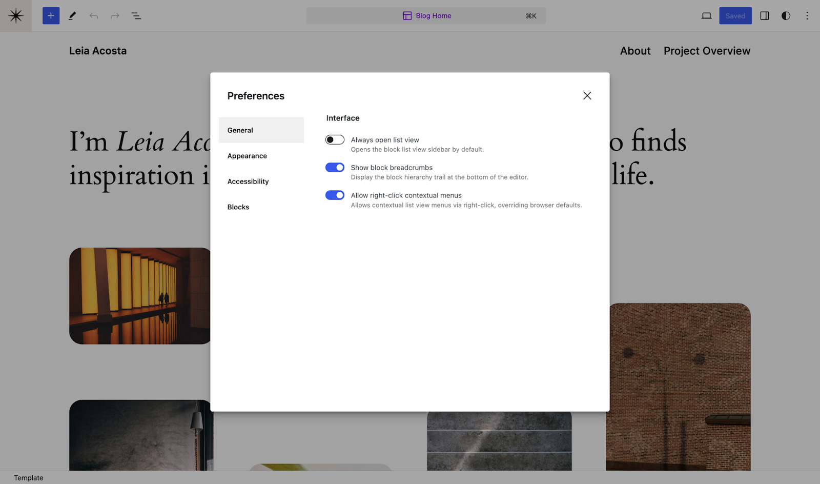
It’s now much easier to manage your site and post-editing preferences, which have been combined and enhanced in the latest update. In addition to familiar settings, you’ll find new appearance and accessibility options, and an “allow right click” toggle which allows you to override stubborn browser defaults. You can access your preferences by heading to the three-dot menu at the top right of the editor and clicking “Preferences” at the bottom.
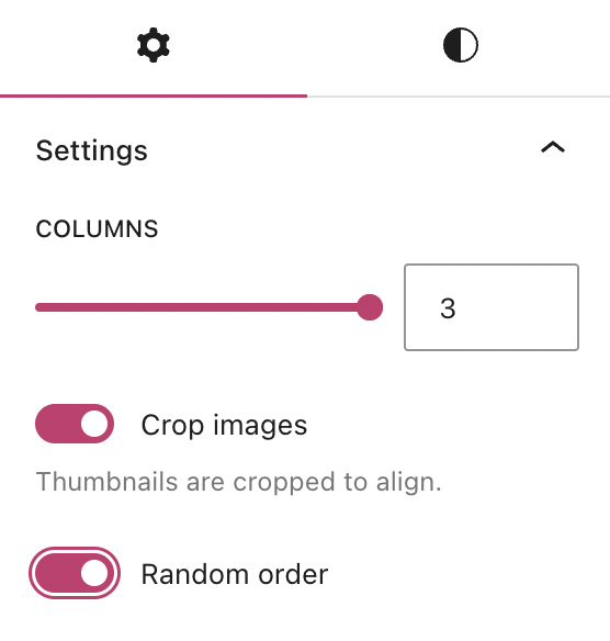
Randomized gallery images
The Gallery Block’s always been a great way to show off a collection of photos or images. And now there’s a fun new setting to randomize the order in which those images appear every time the page or post is loaded by a new visitor.
You can turn this setting on with a toggle found at the bottom of the block settings pane:
Streamlined edits in List View
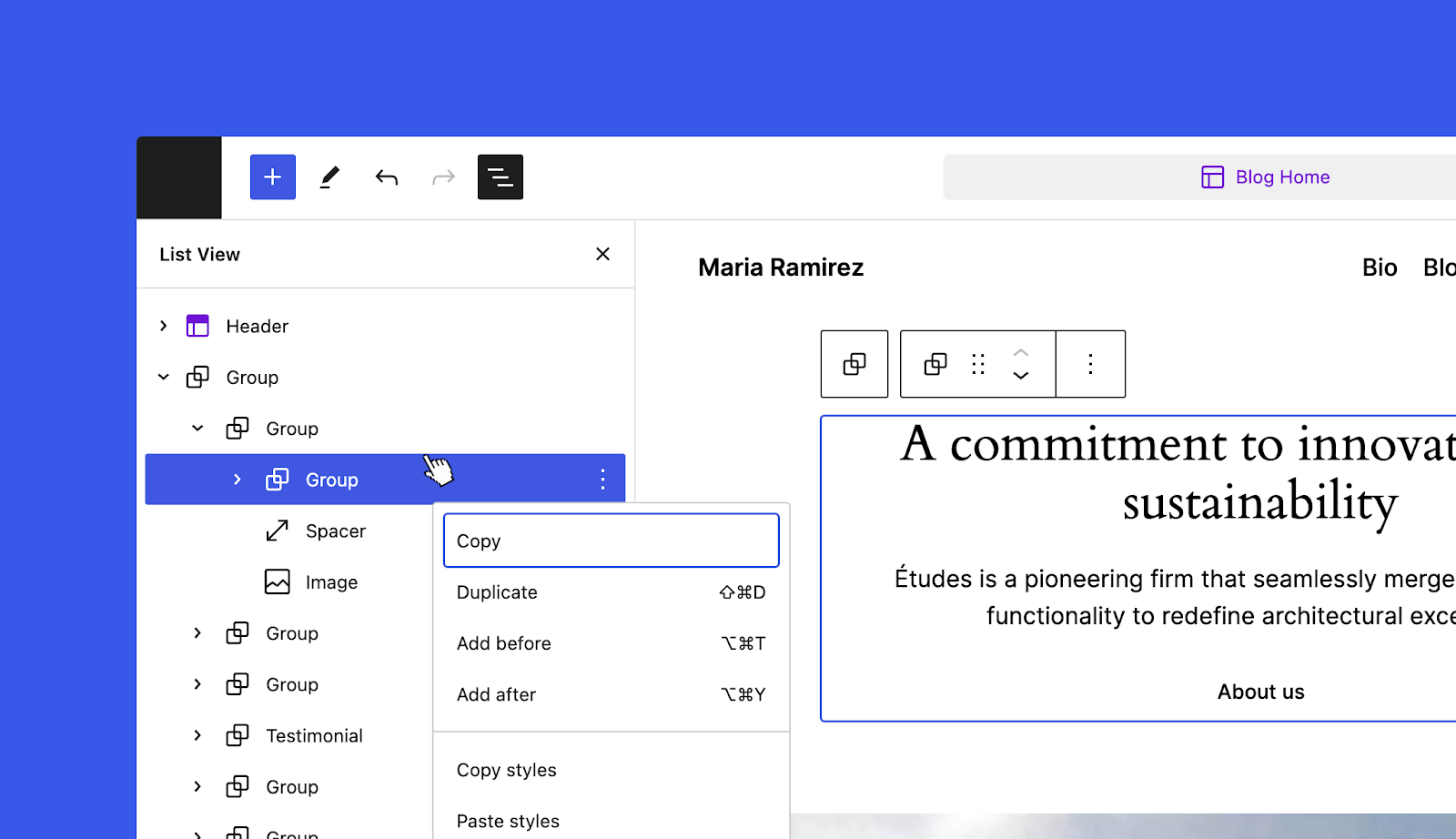
Not everybody knows about the Site Editor’s List View, but it can make editing your site, posts, and pages significantly faster and easier. A new addition to the List View makes editing even more convenient: just right-click any item in the list to open up the settings menu for the selected block.
Even small changes can make a big difference to your workflow, and your site visitor’s overall experience.
We’d love to hear what you think about the new features when you’ve had a chance to take them for a test drive!
Read more https://wordpress.com/blog/2024/02/20/site-editor-updates/