Hot Off the Press: New WordPress.com Themes for April 2024
The WordPress.com team is always working on new design ideas to bring your website to life. Check out the latest themes in our library, including great options for minimalist bloggers, retailers, and creatives of all stripes.
All WordPress.com ThemesAlter

Alter is a lean theme for bloggers that gets directly to the point, showing text-only posts right above the fold ornamented by a single image. The bold default color scheme plays against the minimalist content design for a fun and surprising aesthetic. And, of course, you can always change those default styles if pink and purple aren’t your thing.
Click here to view a demo of this theme.
Swag

As you might have gathered from the name of this sharp new theme, Swag is built with product sales in mind from the very start. This theme boasts a minimalist design aesthetic, ensuring your products take center stage. While Swag is perfect for fashion boutiques, its versatility knows no bounds. Whether you’re selling apparel, accessories, or even digital goods, this theme provides the perfect canvas for your unique brand identity.
Built with WooCommerce compatibility at its core, Swag ensures a seamless shopping experience for your customers. From product pages to checkout, every step is optimized for maximum conversion.
Click here to view a demo of this theme.
Stage

Stage is where artistic expression meets simplicity and is a new go-to WordPress.com theme for artists and creatives. Its simple yet powerful interface allows for easy content organization, while the elegant two-column grid layout beautifully highlights your work. With seamless mobile responsiveness and a focus on readability, Stage lets your creativity take center stage (sorry, we just had to!).
Powered by the Inter Tight font and a subtle duotone color palette, this theme exudes authenticity and raw creativity. Personalize your site effortlessly with included color variations.
Click here to view a demo of this theme.
Roam
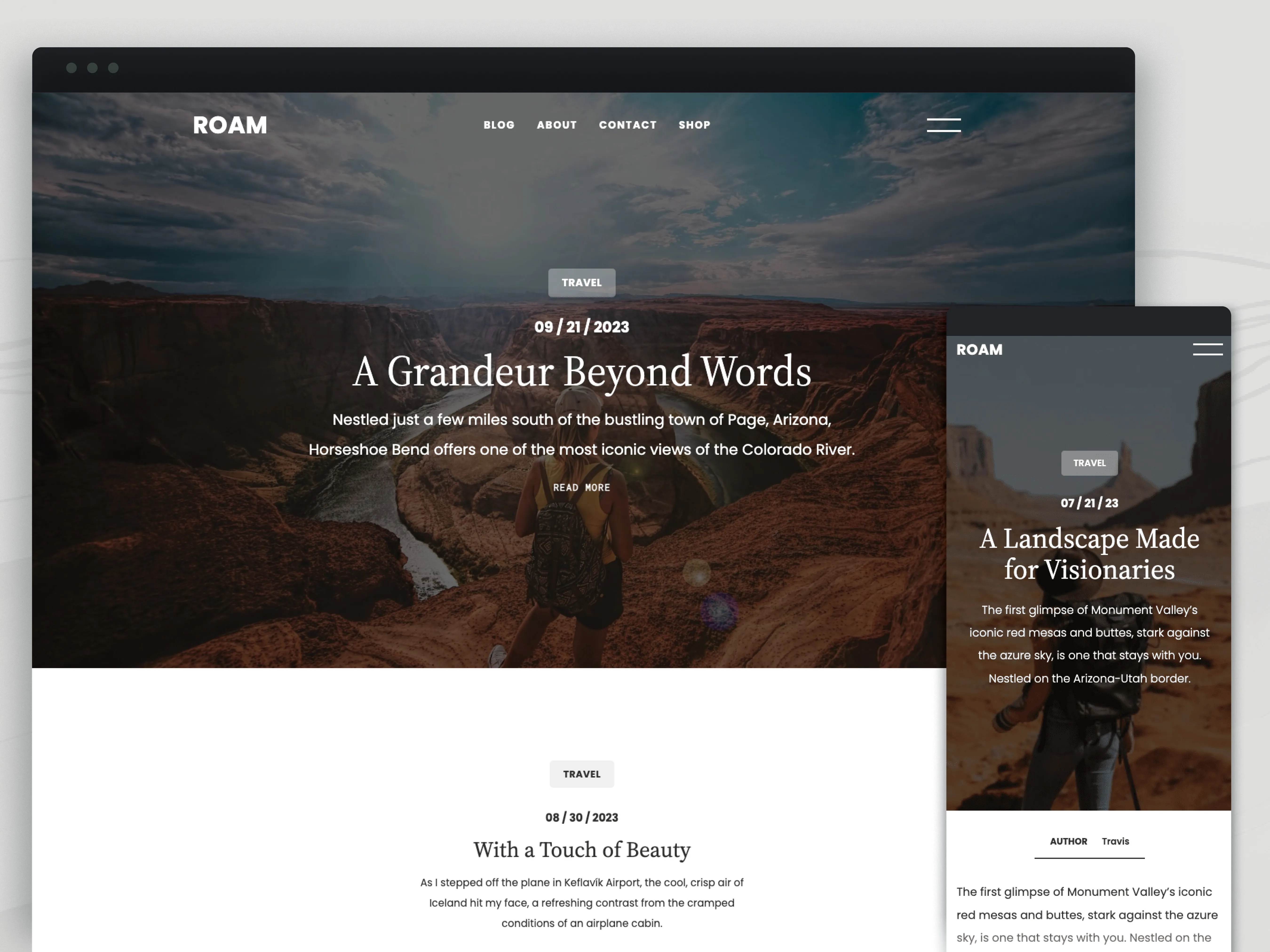
Roam invites bloggers, travelers, and creatives to embark on a seamless journey of storytelling. With its captivating full-page cover photo and sleek one-column layout, Roam offers a canvas for your unique voice and vision. Tailor your blog effortlessly with customizable fonts, colors, and layouts and let your best work shine with Roam’s featured article showcase. Built-in SEO optimization ensures global visibility and searchability.
Click here to view a demo of this theme.
Boxed Bio

Boxed Bio heralding a new era of dynamic expression in the “link in bio” category of themes. Through an artful arrangement of column blocks adorned in vibrant hues and captivating images, Boxed Bio transforms simple links into enduring and inspiring narratives. With its three column groups, each a canvas for visual storytelling, and jazzy typography choices this invites you to unleash your creativity. These aren’t just links, after all, they are doorways to possibility.
Click here to view a demo of this theme.
To install any of the above themes, click the name of the theme you like, which brings you right to the installation page. Then click the “Activate this design” button. You can also click “Open live demo,” which brings up a clickable, scrollable version of the theme for you to preview.
Premium themes are available to use at no extra charge for customers on the Explorer plan or above. Partner themes are third-party products that can be purchased for $79/year each.
You can explore all of our themes by navigating to the “Themes” page, which is found under “Appearance” in the left-side menu of your WordPress.com dashboard. Or you can click below:
All WordPress.com ThemesRead more https://wordpress.com/blog/2024/04/26/wordpress-themes-april-24/
- Details
- Category: Dev News
DirectoryTree Authorization is a Native Role and Permission Management Package for Laravel

The DirectoryTree Authorization package by Steve Bauman is an easy, native role and permission management system for Laravel.
<script async src="https://platform.twitter.com/widgets.js" charset="utf-8"></script>If you need a super simple native feeling Laravel Authorization package, this one may tickle your fancyhttps://t.co/Xiu4Ty0IkR
— Steve (@ste_bau) April 23, 2024
It works with Laravel's Gate and authorization methods out of the box, and offers the following lightweight API to manage roles and permissions:
use DirectoryTree\Authorization\Permission;
use DirectoryTree\Authorization\Role;

$createUsers = Permission::create([
    'name' => 'users.create',
    'label' => 'Create Users',
]);

$admin = Role::create([
    'name' => 'administrator',
    'label' => 'Admin',
]);

// Grant the permission to a role
$admin->permissions()->save($createUsers);

// Assign the role to a user
$user->roles()->save($admin);

// `can()` method usage in PHP:
Auth::user()->can('users.create');

// Using Laravel's `Gate`:
Gate::allows('users.create');

// Using Laravel's `@can()` directive:
@can('users.create')
    <!-- This user can create other users. -->
@endcan
The above code snippet doesn't contain every method available—see the readme for usage details on managing roles and permissions with this package, which includes the following main features:
- Manage User roles and Permissions
- Create user-specific permissions
- Checking permissions and roles
- Caching permissions by default
- Use with Laravel's native Gate and authorization methods.
- Permissions are registered in Laravel's Gate by default
- Includes useful permission and role middleware
To get started with this package, check out package on GitHub at directorytree/authorization.
The post DirectoryTree Authorization is a Native Role and Permission Management Package for Laravel appeared first on Laravel News.
Join the Laravel Newsletter to get all the latest Laravel articles like this directly in your inbox.
Read more https://laravel-news.com/directorytree-authorization-for-laravel
- Details
- Category: Dev News
Sort Elements with the Alpine.js Sort Plugin

Alpine.js has a new first-party Sort plugin in the ecosystem, which allows you to easily re-order elements by dragging them with your mouse. The Sort plugin uses the SortableJS project under the hood for the heavy lifting of sorting elements and provides a nice API for Alpine:
<ul x-sort>
    <li x-sort:item>foo</li>
    <li x-sort:item>bar</li>
    <li x-sort:item>baz</li>
</ul>
This small, yet mighty plugin provides the following features:
- Sorting groups
- Custom drag handles
- Support for Ghost elements
- Customizable configuration for SortableJS
The author Caleb Porzio has also created a new screencast series on the Livewire Site for the Sort plugin. It takes you deep into building a sortable drag-and-drop experience from the JS to the database.

The series consists of 11 videos with over an hour of content:
- Building a Todo List
- Storing positions in the database
- Using Alpine's Sort Plugin
- Sorting items in the database
- Handling removals
- Adding drag handles
- Extracting a Blade Component
- Extracting an Eloquent Trait
- Re-arranging Items
- Sorting between groups
To get started with the Sort plugin, check out the Alpine Documentation. You can also view the Sort screencasts on the Livewire Website.
The post Sort Elements with the Alpine.js Sort Plugin appeared first on Laravel News.
Join the Laravel Newsletter to get all the latest Laravel articles like this directly in your inbox.
Read more https://laravel-news.com/alpine-sort-plugin
- Details
- Category: Dev News
Meet Studio: Your New Favorite Way to Develop WordPress Locally
Say goodbye to manual tool configuration, slow site setup, and clunky local development workflows, and say hello to Studio by WordPress.com, our new, free, open source local WordPress development environment.
We’ve built Studio to be the fastest and simplest way to build WordPress sites locally.
Designed to empower developers, designers, and site builders, Studio offers a seamless solution for creating and running WordPress sites directly on your local machine, as well as showcasing work-in-progress sites with your clients, teams, and colleagues.
Check out a few of our favorite features in the video below:
A new way to develop WordPress locally, available for free
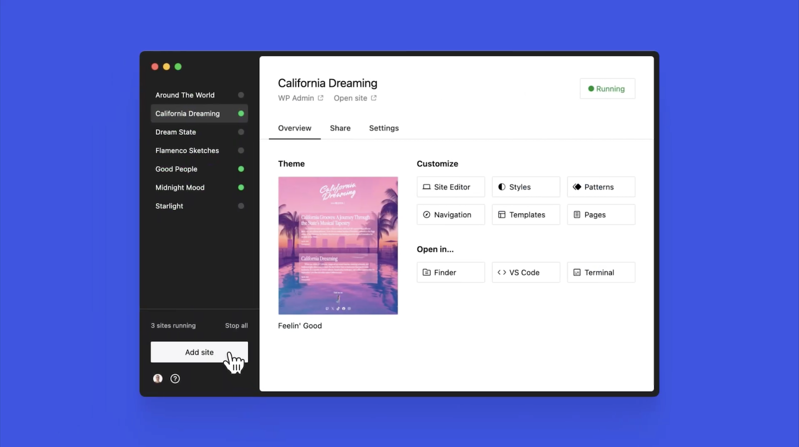
Studio is now available to use for free on Mac*, and you can get up and running with a new local site in just a few minutes:
- Download Studio for Mac.
- Install and open Studio.
- Click Add site, and you’re done!
Once you have a local site running, you can access WP Admin, the Site Editor, global styles, and patterns, all with just one click—and without needing to remember and enter a username or password.
You can even open your local sites in your favorite development tools, such as VS Code, PhpStorm, Terminal, and Finder, making it even easier to add Studio to your existing development workflow.
Plus, Studio is open source; feel free to fork away on GitHub.
*A Windows version of Studio is coming soon, and you can request early access here.
Effortlessly share your work and keep moving forward
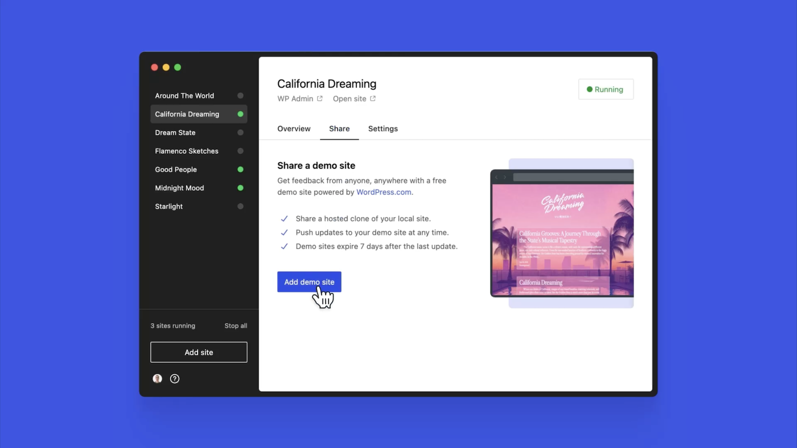
In the realm of web development, showcasing local work has often been a challenge when projects live solely on your machine. With Studio’s demo sites, you have a convenient, built-in solution for sharing your progress with your team, clients, or designers.
These publicly-accessible demo sites, hosted on WordPress.com, are a convenient way to share your work without the need for complex server setups or lengthy deployments. In less than 15 seconds, you can have a shareable link to your local site that stays active for seven days.
The best part? Demo sites can be refreshed to reflect your latest build, allowing you to easily convey any updates or changes!
Breaking free from traditional constraints
Unlike traditional local environment tools like MAMP or Docker, Studio takes a fresh approach to local WordPress development. Studio is a lightweight and efficient solution that minimizes overhead and maximizes simplicity by forgoing the need for web servers, MySQL servers, or virtualization technologies.
Behind the scenes, Studio uses WordPress Playground, the WebAssembly-powered PHP binary. Thanks to this technology, there is no need to use a traditional web server, making your development experience much quicker and smoother.
Say goodbye to complex setups and compatibility issues. Studio makes it easier than ever to build and manage WordPress sites locally.
Let’s get building
At WordPress.com, we’re committed to making your website management experience seamless. In the last few years alone, we launched staging sites with synchronization features, SSH and WP-CLI access, global edge caching, GitHub Deployments, and more.
Studio is yet another powerful feature to add to your toolkit. Stay tuned for more exciting updates, and remember to follow our blog to stay in the loop.
And, of course, download Studio today. Your local development workflow will thank you.
Major kudos to the Studio team on this launch! Antonio Sejas, Antony Agrios, Kateryna Kodonenko, Philip Jackson, Carlos García Prim, David Calhoun, Derek Blank, Siobhan Bamber, Tanner Stokes, Matt West, Adam Zielinski, Brandon Payton, Berislav Grgicak, Alexa Peduzzi, Jeremy Massel, Gio Lodi, Olivier Halligon, Matthew Denton, Ian Stewart, Daniel Bachhuber, Kei Takagi, Claudiu Filip, Niranjan Uma Shankar, Noemí Sánchez, and our beta testers.
Read more https://wordpress.com/blog/2024/04/24/studio/
- Details
- Category: Dev News
Anonymous Event Broadcasting in Laravel 11.5

This week, the Laravel team released v11.5, with anonymous event broadcasting, Blade performance improvements, generating URLs with query parameters, and more.
Anonymous Event Broadcasting
Joe Dixon contributed anonymous broadcasts in Laravel for real-time applications using Laravel Echo:
Sometimes you may wish to broadcast an ad-hoc event.
An ad-hoc event is one where you don't need to hook into it anywhere else in your application. You just want to notify the frontend of something.
For this, you don't want to go to the trouble of creating a brand new event, you just want to fire off a message.
For this, we can use an anonymous broadcast using the Broadcast facade, which can be as simple as:
Broadcast::on('my-channel')->send();

// You may dispatch to multiple channels at the same time:
Broadcast::on([
    'my-channel',
    new PrivateChannel('my-channel'),
    'presence-my-channel'
)->send();

// Broadcast the anonymous event on a private or presence channel
Broadcast::private('my-channel')->send();
Broadcast::presence('my-channel')->send();
To learn more about anonymous event broadcasting in Laravel, check out Laravel's Documentation.
Blade Performance Improvements
Taylor Otwell shared a thought about supercharging Blade component rendering performance. Two pull requests were accepted and merged as part of Laravel 11.5, which collectively improved Blade rendering by 20%:
Ability to Generate URLs With Query Params
Steve Bauman contributed the ability to generate URLs
with query parameters via the new query() method:
// https://localhost/products?sort=-name
url()->query('products', ['sort' => '-name']);

// https://localhost/products?columns[0]=name&columns[1]=price&columns[2]=quantity
url()->query('products', ['columns' => ['name', 'price', 'quantity']]);

// Overiding parameters:
// https://localhost/products?sort=-price
url()->query('products?sort=-name', ['sort' => '-price']);

// Appending parameters
// https://localhost/products?sort=-name&search=samsung
url()->query('products?sort=-name', ['search' => 'samsung']);
Add a Default Namespace for make:trait and
make:interface
@milwad-dev contributed a default namespace for
make:trait and make:interface, which will
create these classes in the following paths if they exist:
- Interfaces:
App\Contracts App\Interfaces
- Traits:
App\Concerns App\Traits
If any of those folders exist in your project, Laravel will
create the file in that namespace. For example,
App\Contracts would take precedence over
App\Interfaces. Lastly, the file is created in the
App namespace directly if either of the directories
are not found.
Release notes
You can see the complete list of new features and updates below and the diff between 11.4.0 and 11.5.0 on GitHub. The following release notes are directly from the changelog:
v11.5.0
- [11.x] Add namespace for
make:traitandmake:interfacecommand by @milwad-dev in https://github.com/laravel/framework/pull/51083 - [11.x] Ability to generate URL's with query params by @stevebauman in https://github.com/laravel/framework/pull/51075
- [11.x] Adds anonymous broadcasting by @joedixon in https://github.com/laravel/framework/pull/51082
- [10.x] Binding order is incorrect when using cursor paginate with multiple unions with a where by @thijsvdanker in https://github.com/laravel/framework/pull/50884
- [10.x] Fix cursor paginate with union and column alias by @thijsvdanker in https://github.com/laravel/framework/pull/50882
- [11.x] Fix typo in tests by @milwad-dev in https://github.com/laravel/framework/pull/51093
- Fix argument type in
Cache\Storeby @GromNaN in https://github.com/laravel/framework/pull/51100 - Correct comment's grammatical and semantic errors by @javadihugo in https://github.com/laravel/framework/pull/51101
- [11.x] Replace matches typehint fix by @henzeb in https://github.com/laravel/framework/pull/51095
- [11.x] Exclude
laravel_through_keywhen replicating model, fixes #51097 by @levu42 in https://github.com/laravel/framework/pull/51098 - [11.x] Add enum types to static Rule methods by @erik-perri in https://github.com/laravel/framework/pull/51090
- [11.x] Add decrement method to the rate limiter class by @AlexJump24 in https://github.com/laravel/framework/pull/51102
- [11.x] Remove dead code by @michaelnabil230 in https://github.com/laravel/framework/pull/51106
- [11.x] Fix support for other hashing implementations when using
hashedcast by @j3j5 in https://github.com/laravel/framework/pull/51112 - Revert "[11.x] Adds support for
intbacked enums to implicitEnumroute binding" by @driesvints in https://github.com/laravel/framework/pull/51119 - [11.x] Add support for enums in
whereInroute constraints by @osbre in https://github.com/laravel/framework/pull/51121 - Clarify that \Illuminate\Http\Request::replace replace all input values by @treyssatvincent in https://github.com/laravel/framework/pull/51123
- [11.x] Fix db:show's --counts option by @xuchunyang in https://github.com/laravel/framework/pull/51140
- Update RuntimeException message when no data has been found by @mikemeijer in https://github.com/laravel/framework/pull/51133
- [11] Update DetectsLostConnections.php by @it-can in https://github.com/laravel/framework/pull/51127
- [11.x] Reset connection after migrate for FreshCommand by @driesvints in https://github.com/laravel/framework/pull/51167
- [10.x] Address Null Parameter Deprecations in UrlGenerator by @aldobarr in https://github.com/laravel/framework/pull/51148
- [11.x] Provide context for NestedRules by @imahmood in https://github.com/laravel/framework/pull/51160
- [11.x] Fix renaming columns with
NULLas default on legacy MariaDB/MySQL by @hafezdivandari in https://github.com/laravel/framework/pull/51177 - [11.x] Supercharge Blade by @assertchris in https://github.com/laravel/framework/pull/51143
- [11.x] Allow implicit binding to have optional backed enums by @Neol3108 in https://github.com/laravel/framework/pull/51178
- [11.x] Blade Component Loop Speed Improvement by @lonnylot in https://github.com/laravel/framework/pull/51158
- [11.x] Fix normalizedNameCache by @Jubeki in https://github.com/laravel/framework/pull/51185
- [11.x] GenericUser use
getAuthPasswordNameinstead of hardcoded column name by @Daniel-H123 in https://github.com/laravel/framework/pull/51186
The post Anonymous Event Broadcasting in Laravel 11.5 appeared first on Laravel News.
Join the Laravel Newsletter to get all the latest Laravel articles like this directly in your inbox.
Read more https://laravel-news.com/laravel-11-5-0
- Details
- Category: Dev News
- WordPress Block Patterns Give You Superpowers
- Microsoft Clarity Integration for Laravel
- Apply Dynamic Filters to Eloquent Models with the Filterable Package
- Tamper-Proof core updates for Joomla - TUF making it into 5.1
- Green websites help to keep your feet dry
- Getting to know the team behind Joomla 5.2
- What's new in Joomla 5.1?
Page 1 of 1312